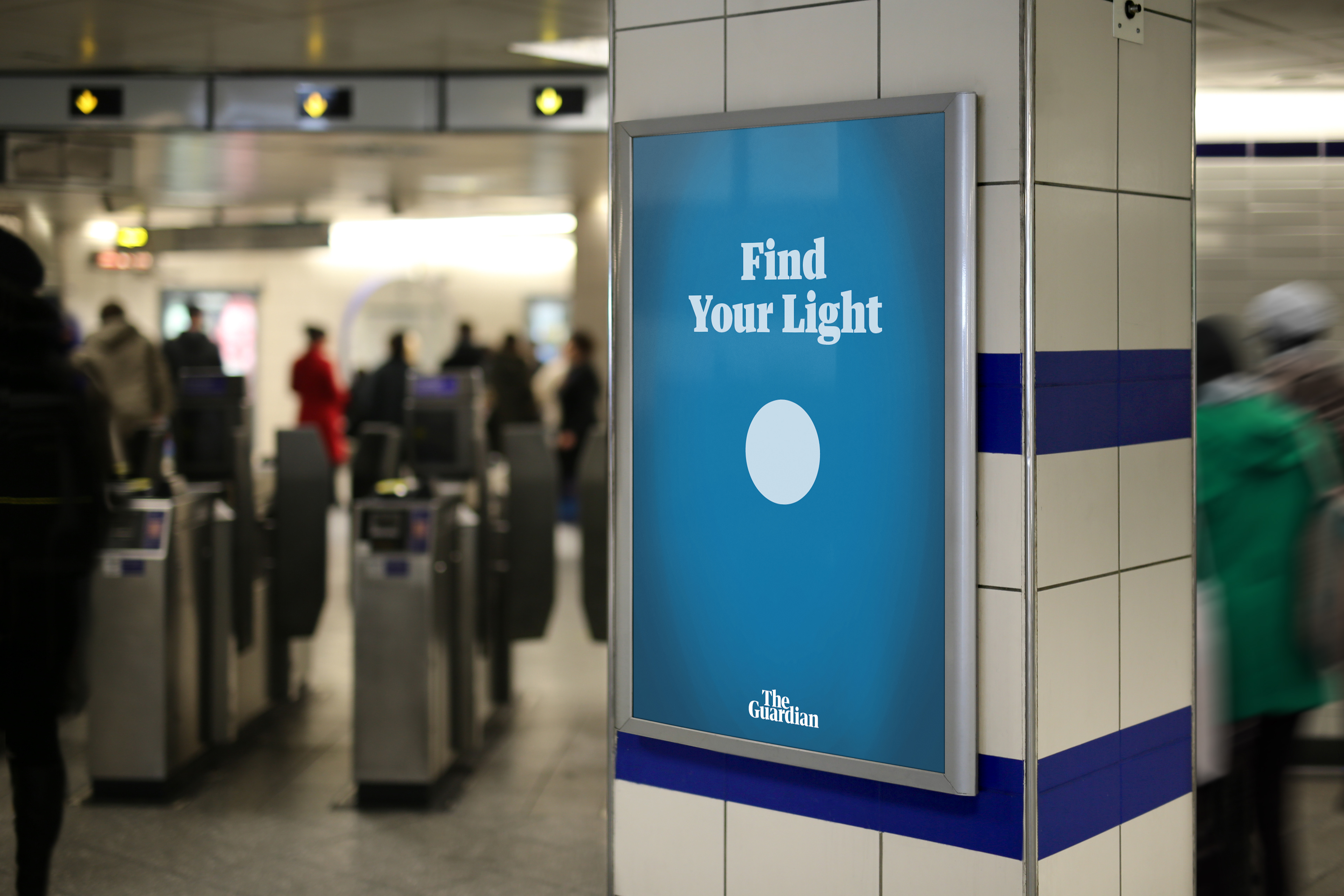
SEE THE LIGHT CAMPAIGN
The campaign focuses on light circular shapes throughout a series of poster designs, the metaphor of the light is truth, facts and shines a light on issues that matter to the target audience. The light shines through the darkness of the posters, the darkness is a metaphor for fake news, social media, memes, negativity and lies. This is my chosen theme as up until now the target audience believes that all news media outlets metaphorically dim and or skew the light to suit their political biases.
The theme shown throughout the campaign is in keeping with the Guardian through the type layout, typefaces used, type setting and use of the logo. The primary poster series visually are dark with heavy metaphorical messages within them to reach out to a specific range of people within the target audience. Accompanied by a secondary poster series which holds a very abstract and contemporary minimalistic style to reach out to another range of people within the target audience to allow this campaign to reach out to as many people within the target audience as possible.
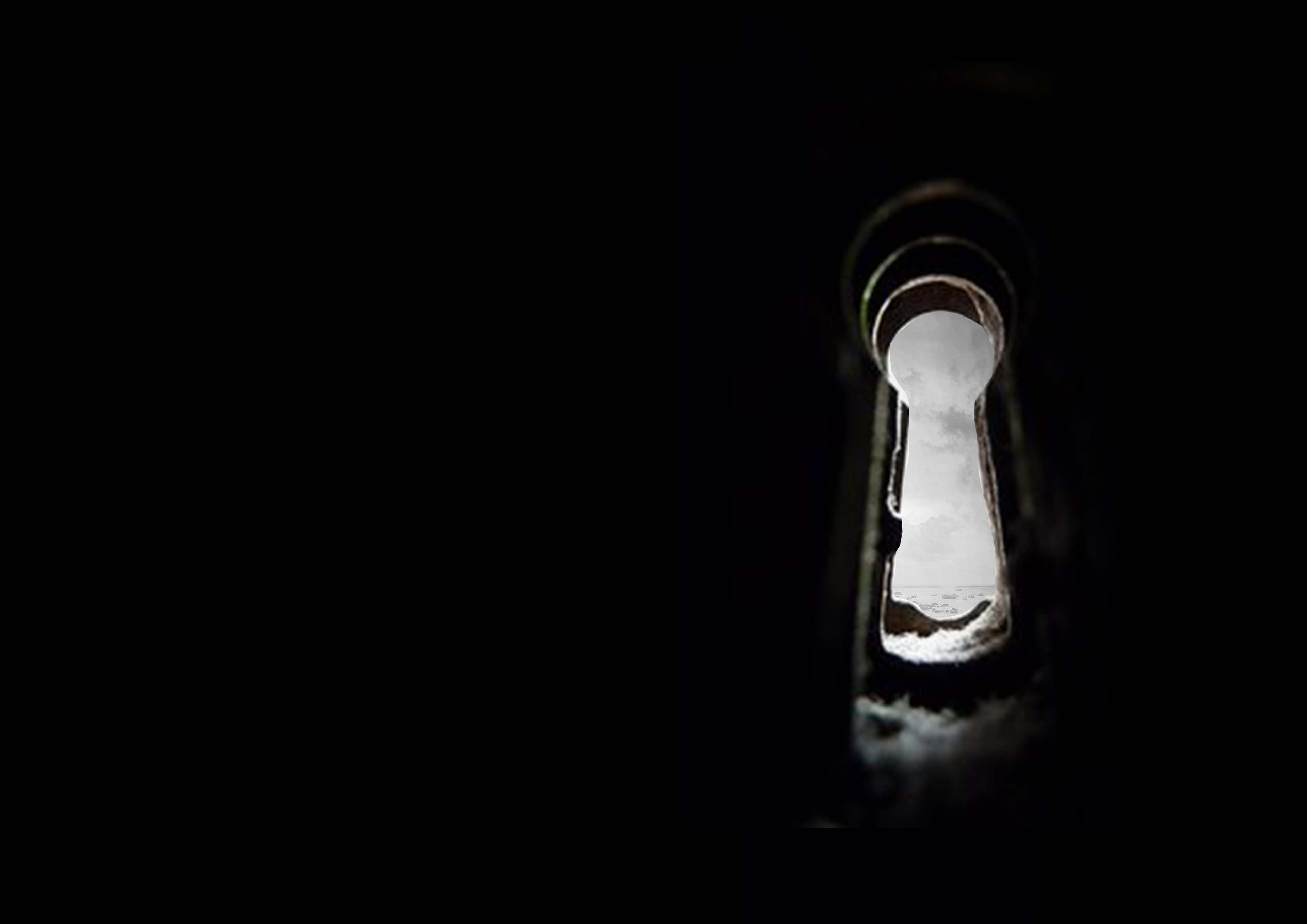
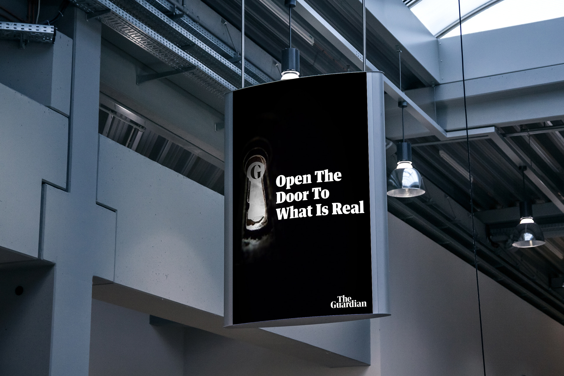
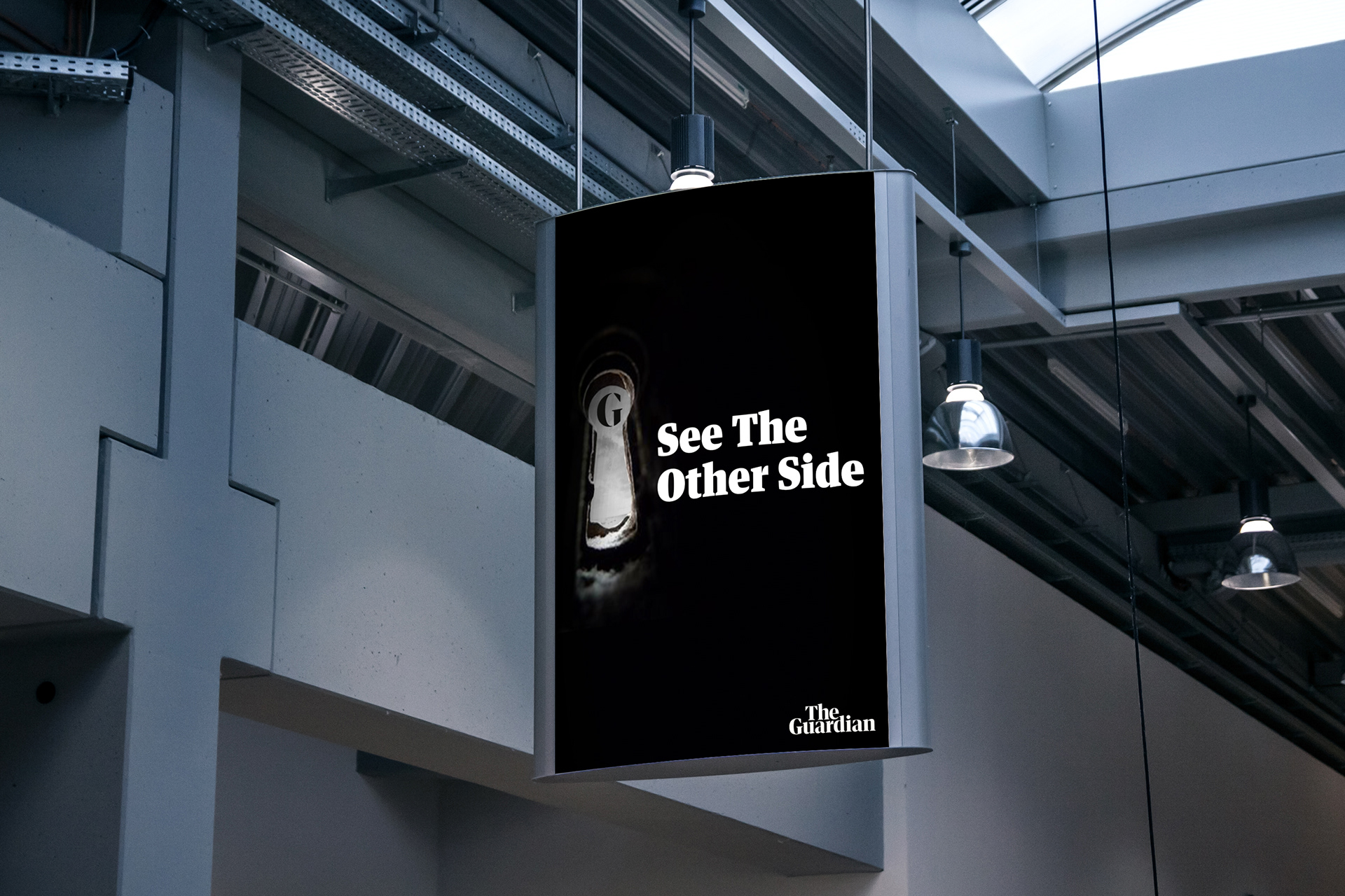
Key Hole Concept:
This advert focuses on ‘the light’ being seen through a key hole and the viewer has the key to get through to the other side of the door. The key is metaphorically acting as the opportunity to have the Guardian available as a platform for young people to use as a place to keep up to date.
The slogan that has been carefully selected talks directly to the viewer due to the word ‘your’ encouraging the viewer to make a change and start to be open minded, optimistic and discover with the Guardian.
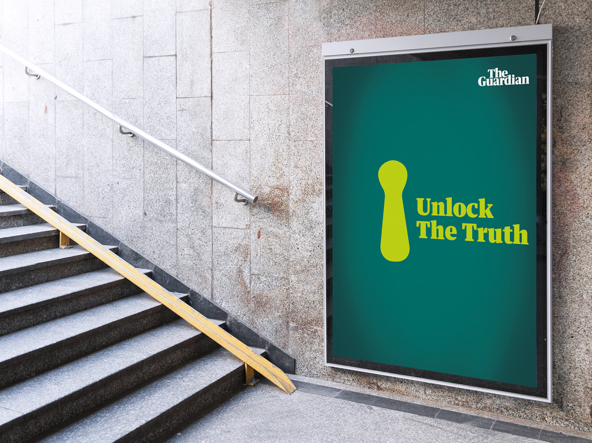
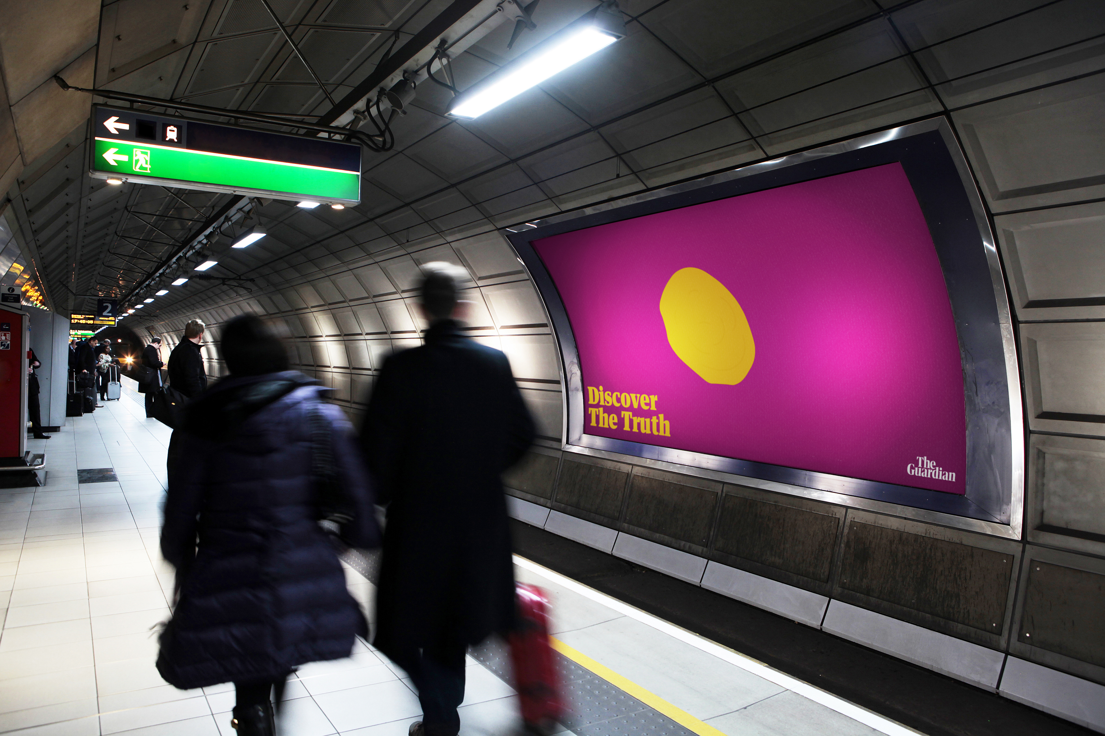
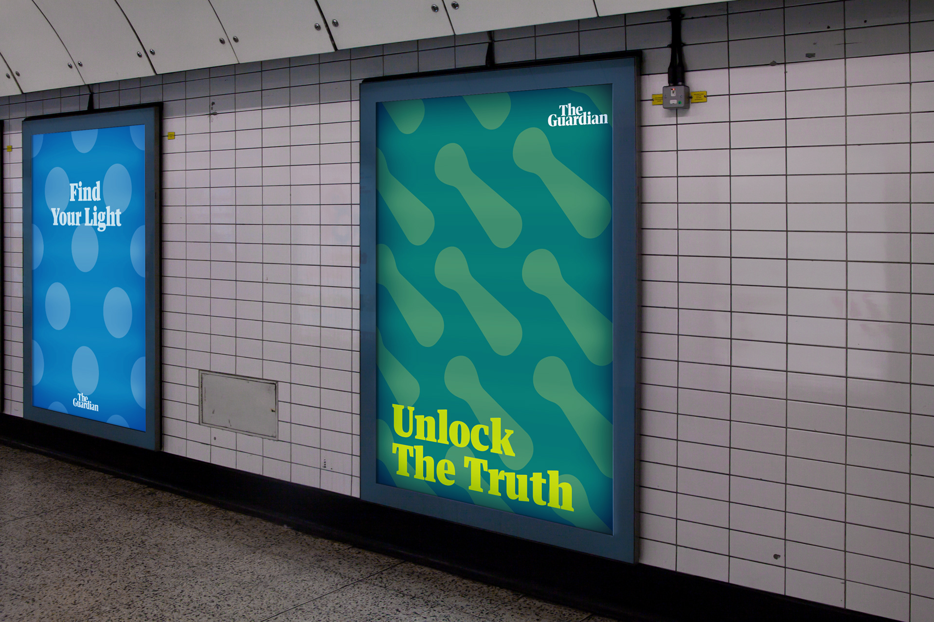
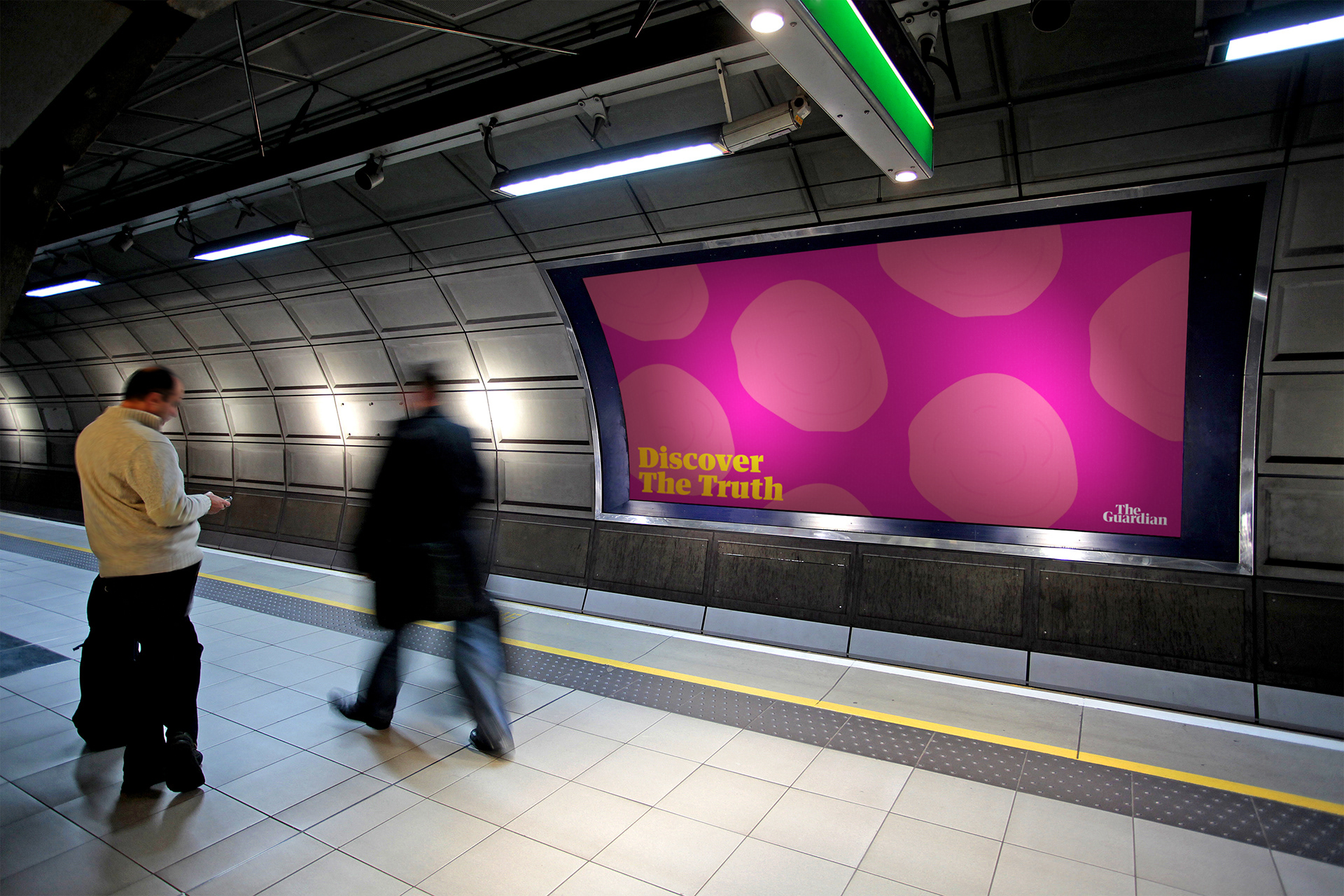
Abstract Style:
The theme of the abstract secondary poster series to display the primary concept in a very minimalistic and contemporary way whilst maintaining synergy to illustrate to the viewer that the two different styles of the poster work together.
The synergy is created through the type setting and layout being the exact same in both primary and secondary posters alongside the main light circular shape being carried across and presented through a 2D flat shape.
The decision to create this came to my mind as in my research I discovered that people, especially young people react to different types of designs as they’re developing and still identifying what appeals to them, as a result of this I wanted to reach out to as many people within the target audience as possible.
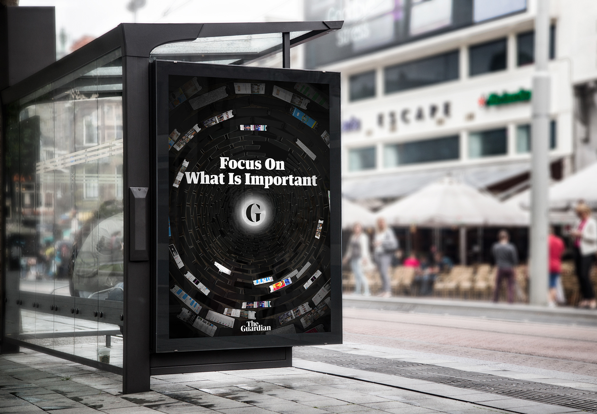
Tunnel Outcome:
This advertisement demonstrates the key message of The Guardian being the light though the darkness of social media and by tackling the stigma of the fake news that is produced and heavily promoted on social media.
Through my research I discovered that the majority of young people within the UK society keeps up to date with news through social media platforms as it fits into their daily routine.
This concept is a creation of a tunnel made out of smart phones with some screens displaying a variety of apps open that people within the target audience would use to keep up to date which I learnt was mainly used by the target audience through research.

Abstract Style
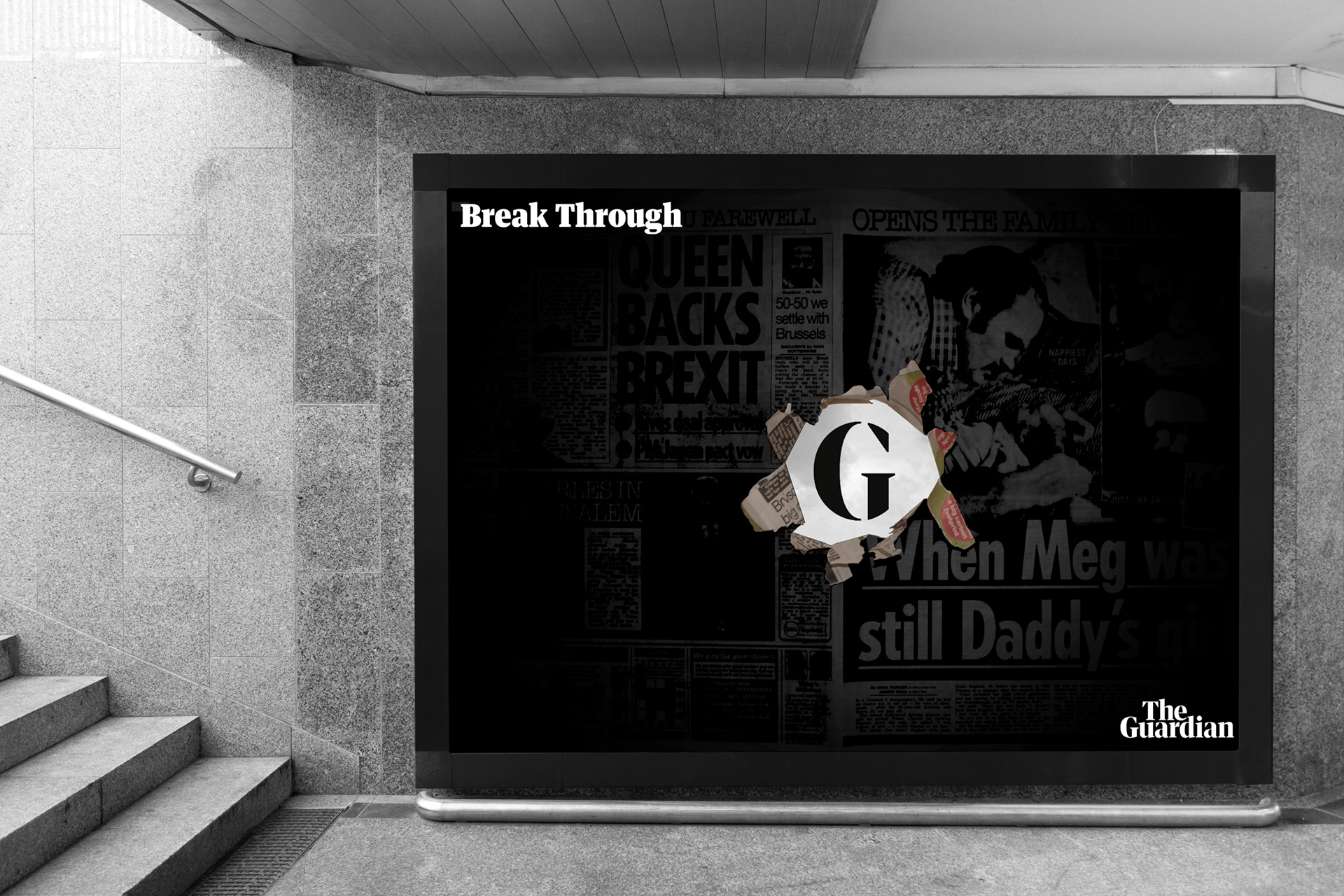
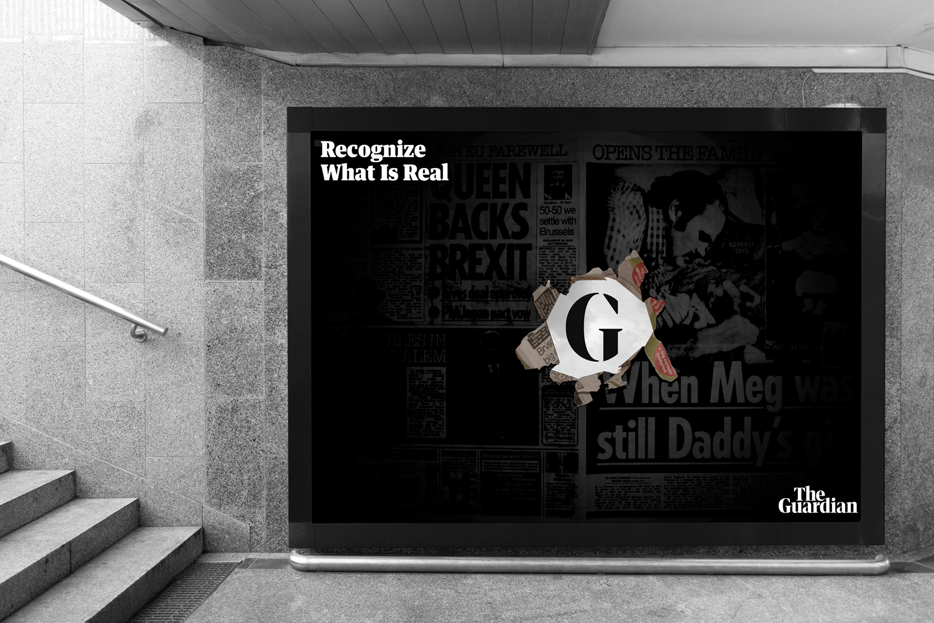
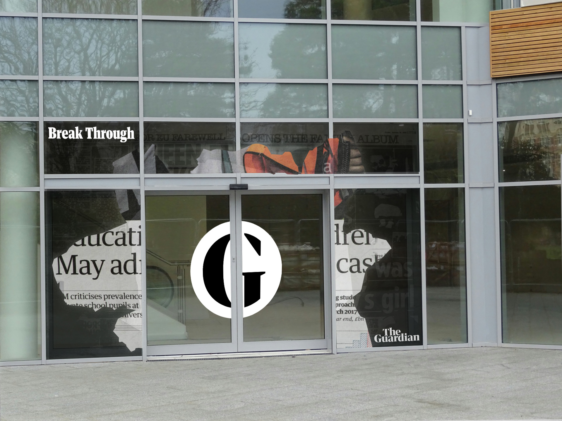
Newspaper Outcome:
This advert is demonstrating that the Guardian is not just a newspaper provider and that it is a much more interactive and interesting platform to gather knowledge from by the logo bursting through a typical newspaper.
This advert is also inspired by the theme of a typical and traditional platform that news has been provided to the general public for years, the logo smashing through this suggests that the Guardian is past this traditional era and provides news in a new and exciting way.
Abstract Style

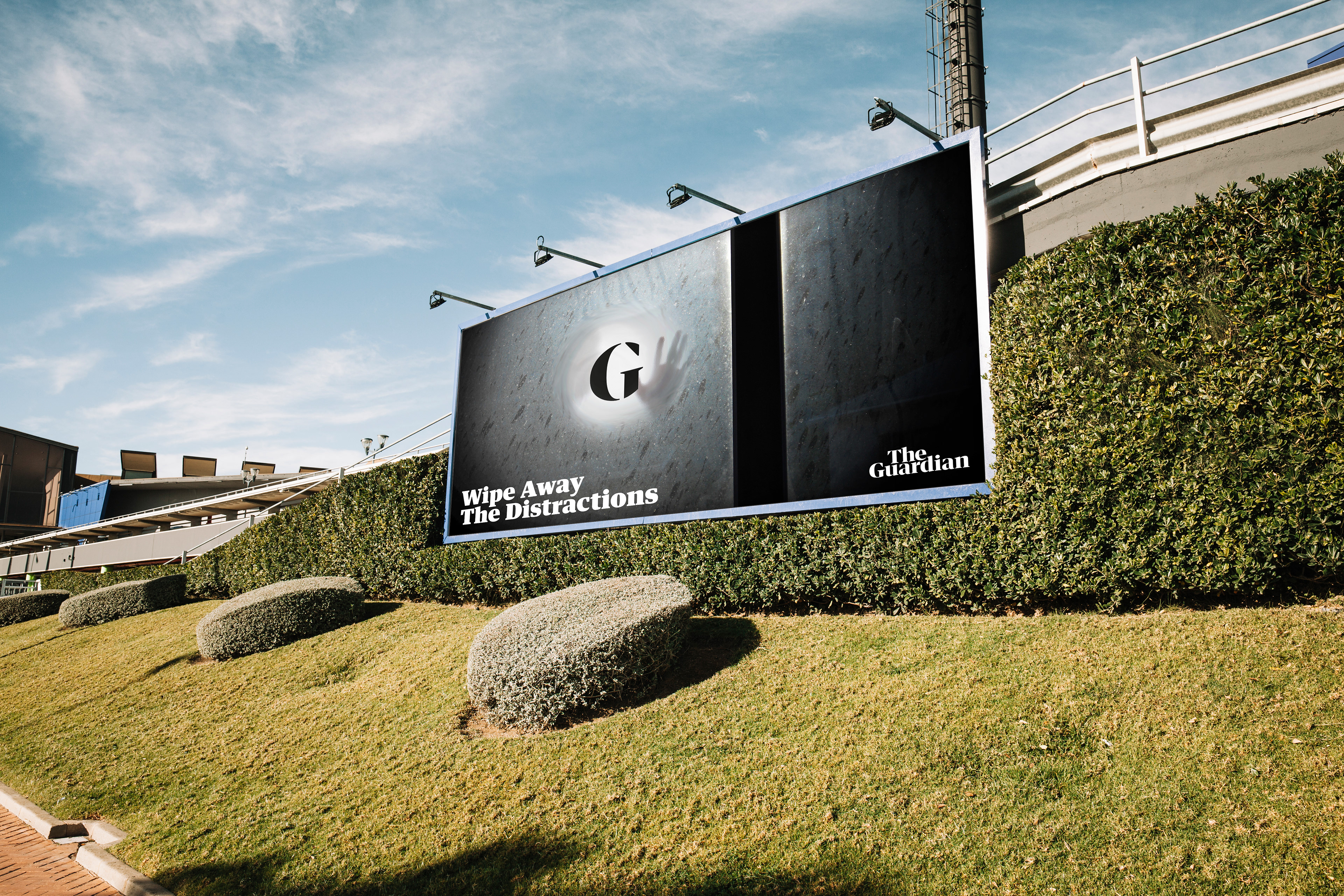
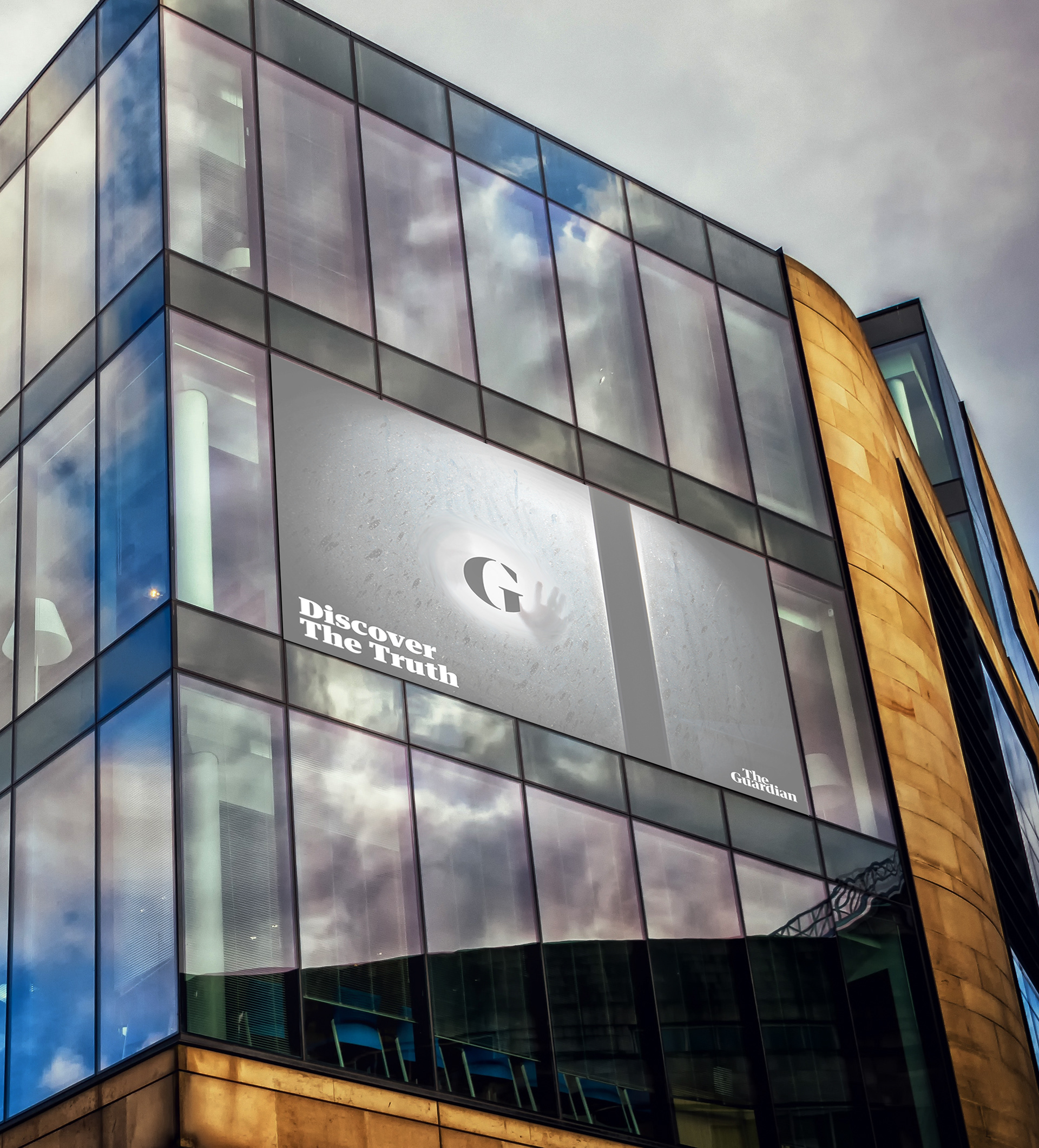
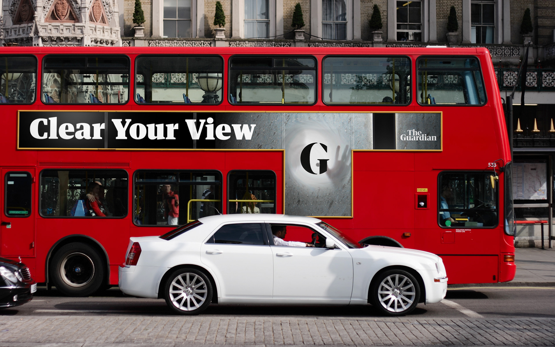
Window Concept:
This advert focuses on the metaphorical message that young people’s vision, opinions and view on what is going on in the world is blurred by fake news promoted on social media and other news platforms focusing their topics on topics that are not relevant to a younger audience.
A dirty window that has been wiped clean in a specific area to see through the dirt is the metaphorical message of a young person finding a trustworthy, open minded and honest platform to discovered what is going on and a place that leaves them a place to form their own opinion to help encourage the target audience to go to the right place to be informed which is the guardian.

Abstract Style
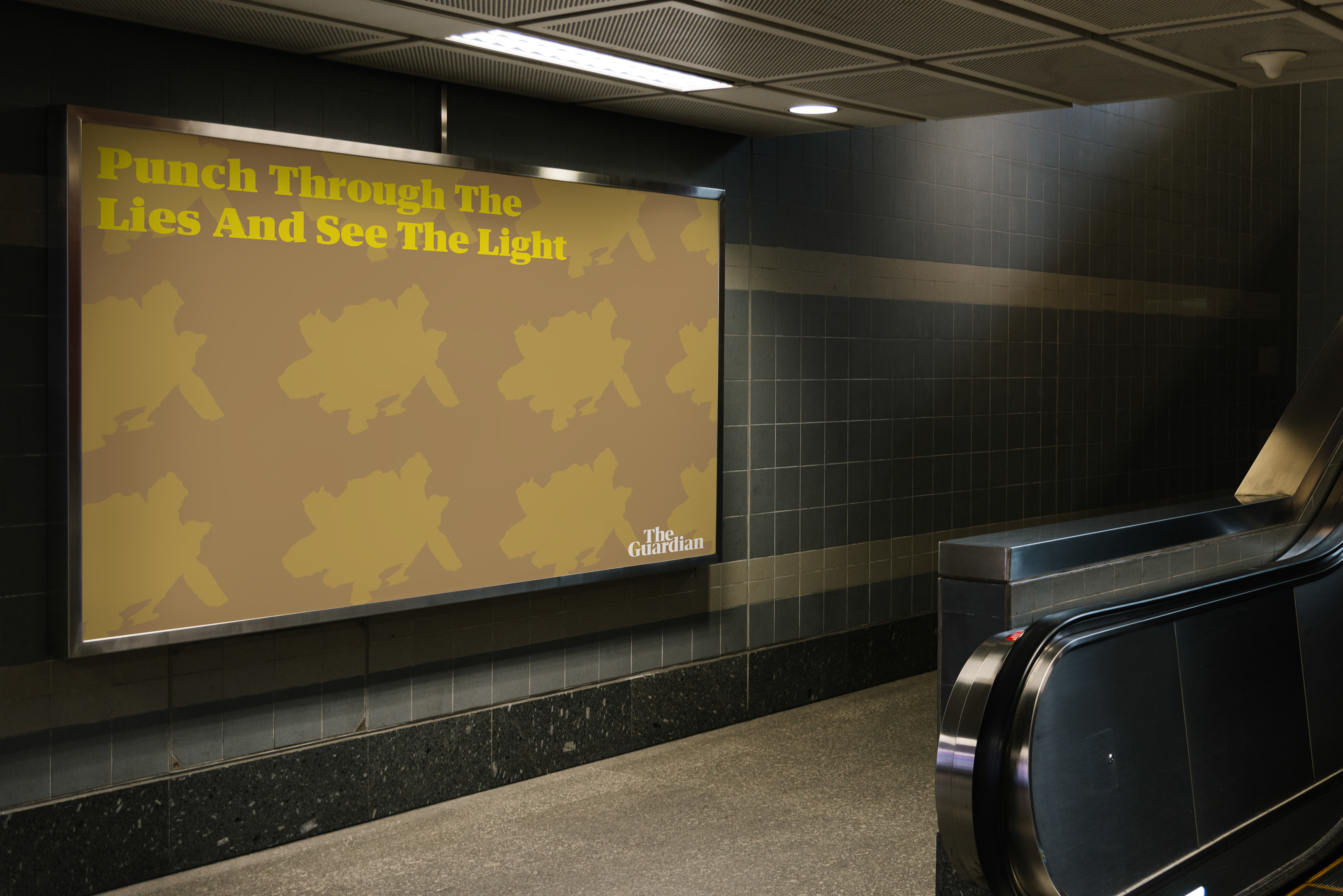
Repetition Outcome:
This poster design uses the element of repetition to put emphasis on the main aim of the campaign which is to ‘find the light’. This example uses the key hole shape which creates not only a visually pleasing pattern but emphasises the key shapes used throughout the campaign making them more memorable. Just like the primary and secondary poster designs each of the repetition adverts focus on the key shapes used for each concept.
Environmental Outcomes:
As the target audience is directed at young adults, creating vinyl that can be designed to be placed on the entrances to Universities and the exterior of Universities is something that would work effectively. The metaphor of someone within the target audience entering their University would be demonstrating someone finding ‘the light’ motivating and encouraging people within the target audience to be open minded and actively thinking with the Guardian.
Further Environmental Outcomes:
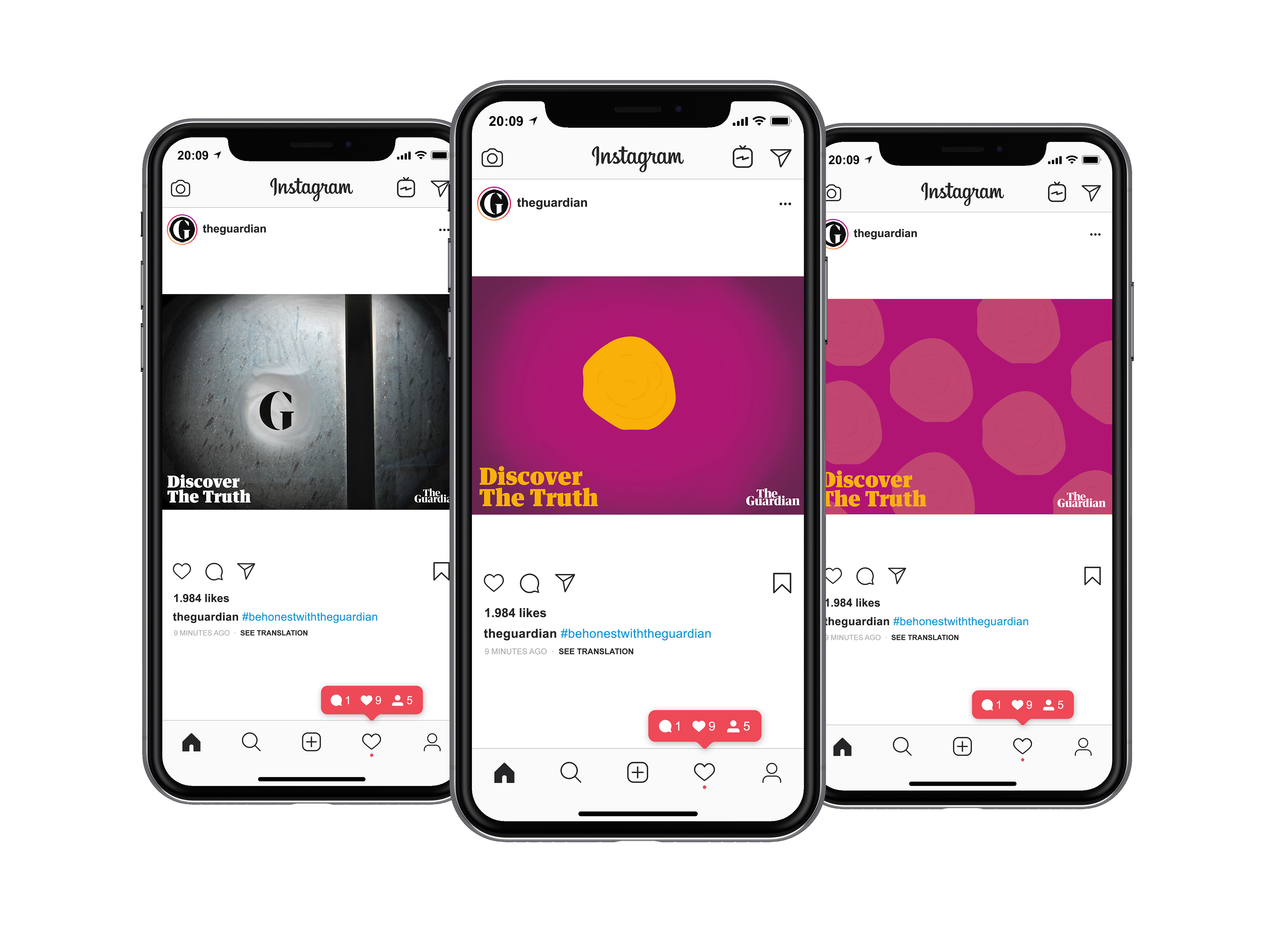
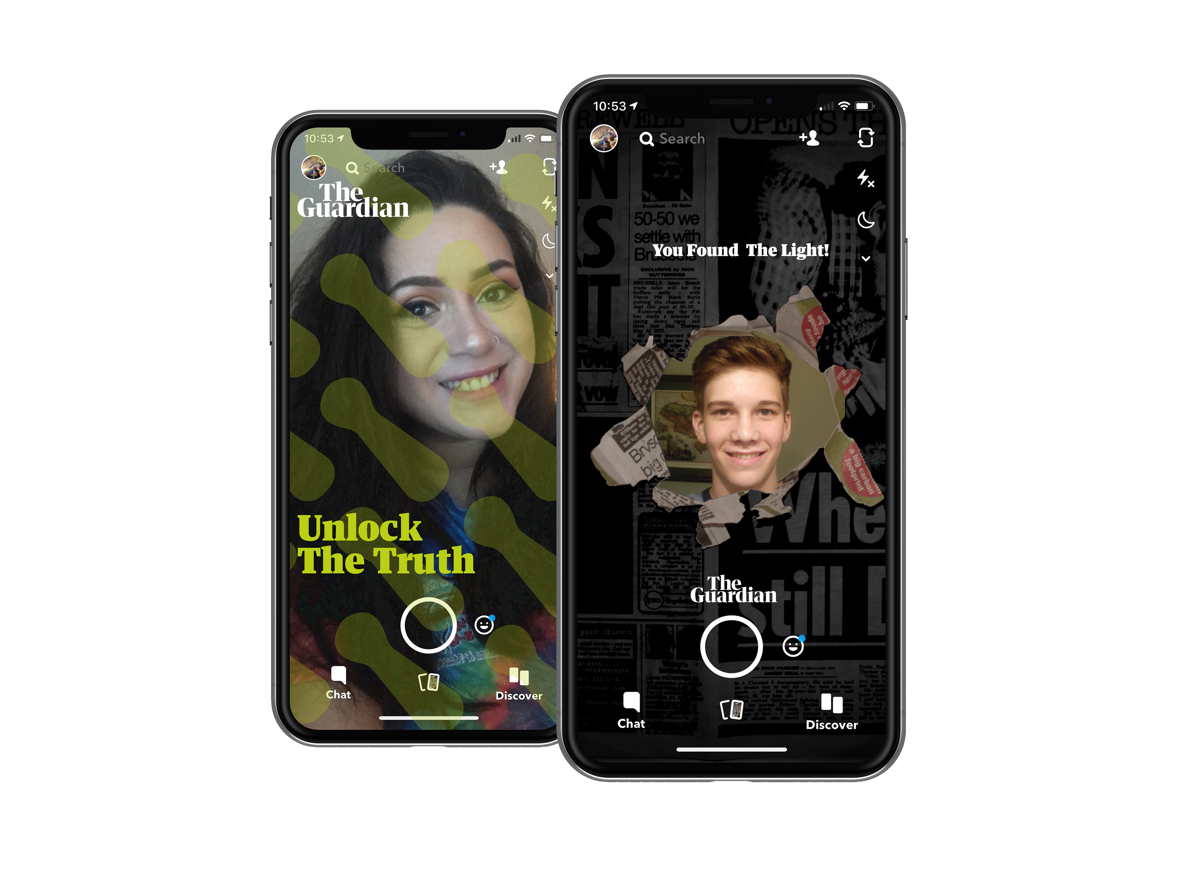
Social Media Outcomes:
Due to the target audience branching towards a younger adult demographic, they would be interacting daily with applications on their phones, one of the most popular of these today is Snapchat. This app also works with multiple brands to create unique filters which work as advertisements and links itself to campaigns. The guardian can create their own filters to help boost knowledge and awareness of the campaign to help maintain knowledge and awareness of the campaign in a non intrusive way.
The lenses can consist of both the more series metaphorical designs that are complex as well as the more simple, fun and minimalistic designs to help recognition throughout the campaign.