ONLINE TV CHANNEL BRANDING
The brief was to create an effective style guide for an upcoming, on demand TV Channel by the University of Northampton which represents the Arts sector at the campus. Below displays the visual style of the TV brand taken from the originally created style guide.
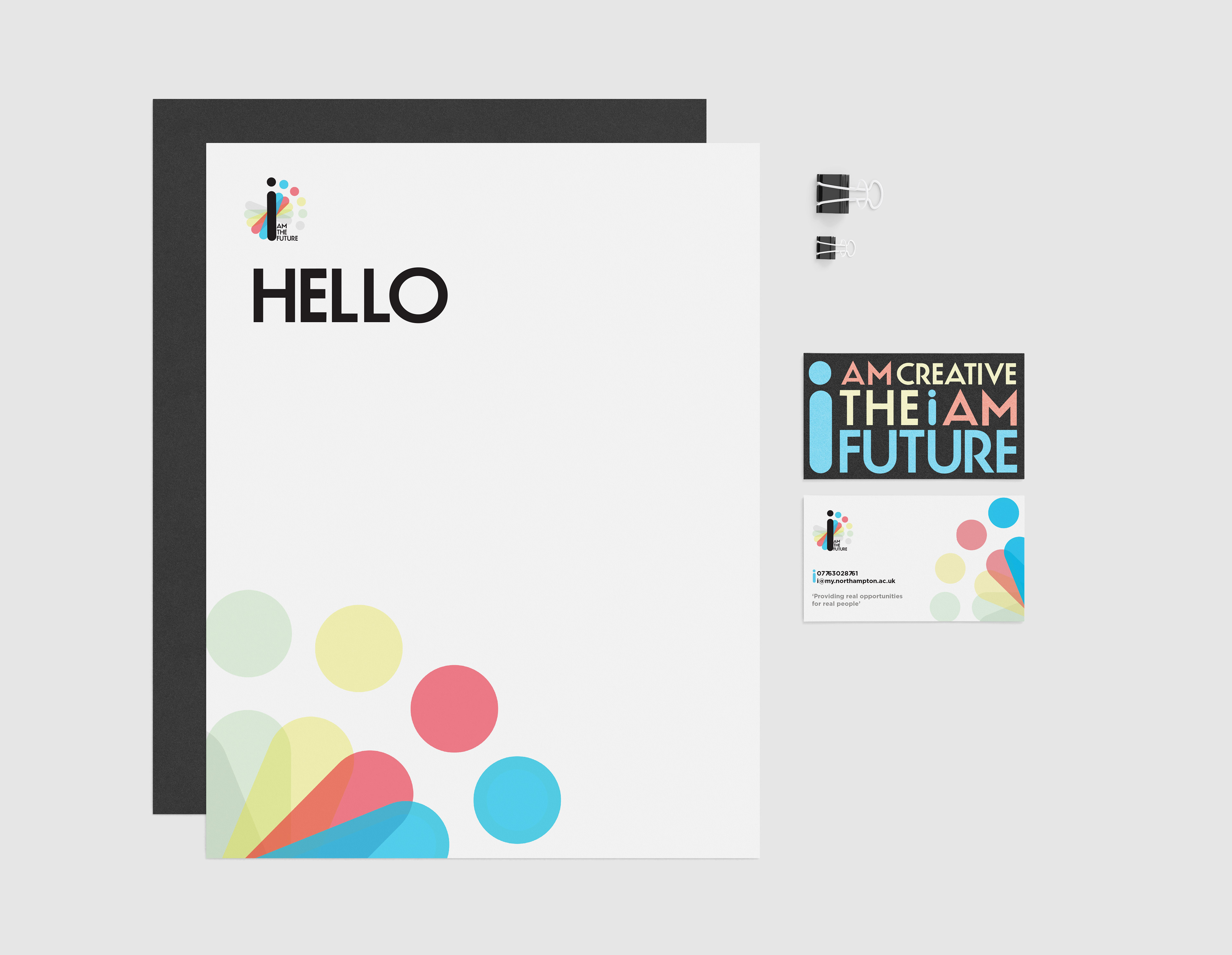
Logo:
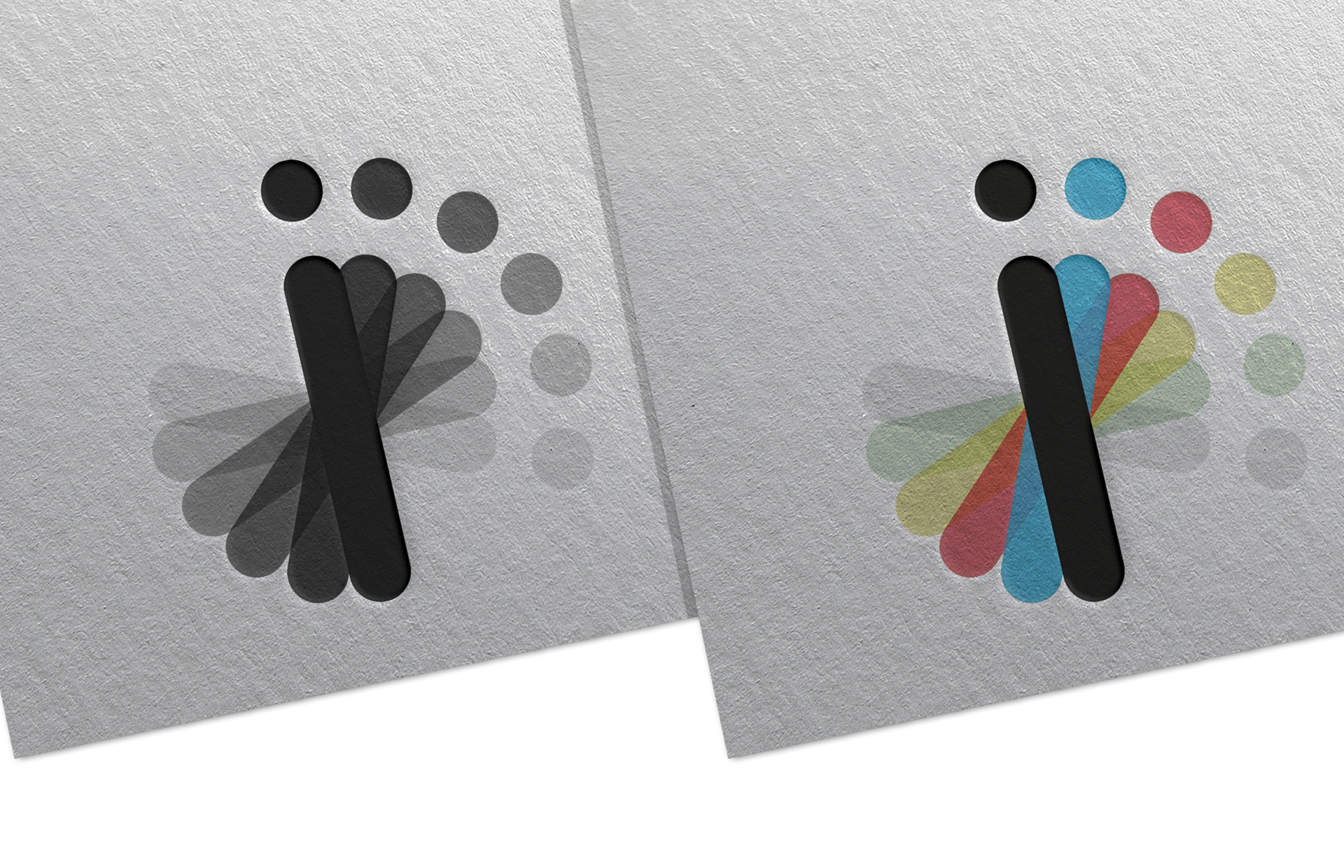
The i logo consists of the letter ‘i’ repeated in a circular motion symbolising movement, more specifically moving forward as helping graduates move forward in their career’s is what we aim to do. The i word-mark is a custom typeface created and designed to give off a clean, modern and professional style.The smooth round curves of the logo emphasises the all roundness of the brand.
The symbol is created through the repetition of the main letter i which is coloured black. The different colour of each eye as it rotates symbolises the different areas within the creative hub that the brand helps supply employers with. The characters of each i have been carefully space to keep consistency as well as legibility, slowly graduating to put emphasis on movement.
Environmental Graphics:
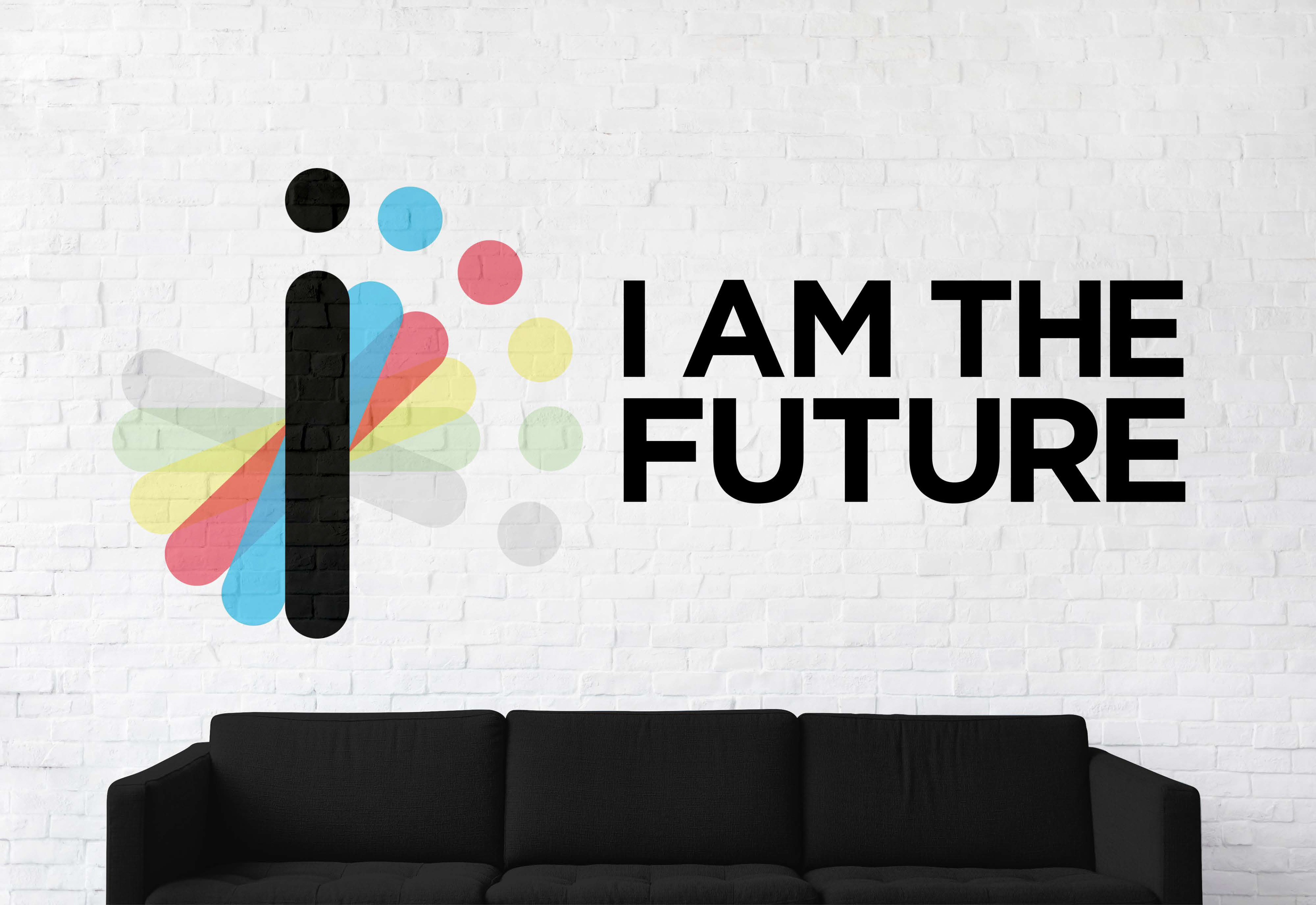
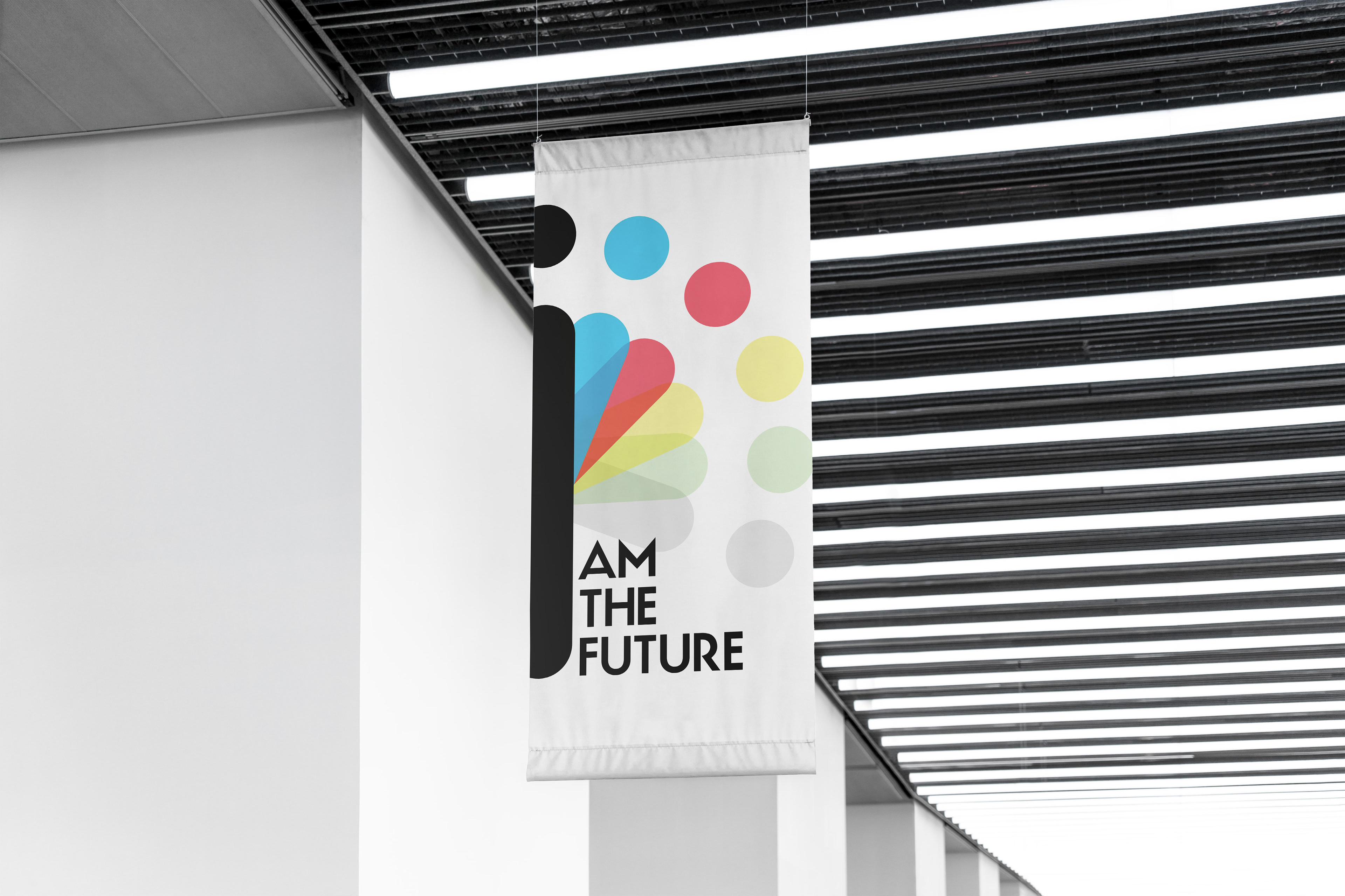
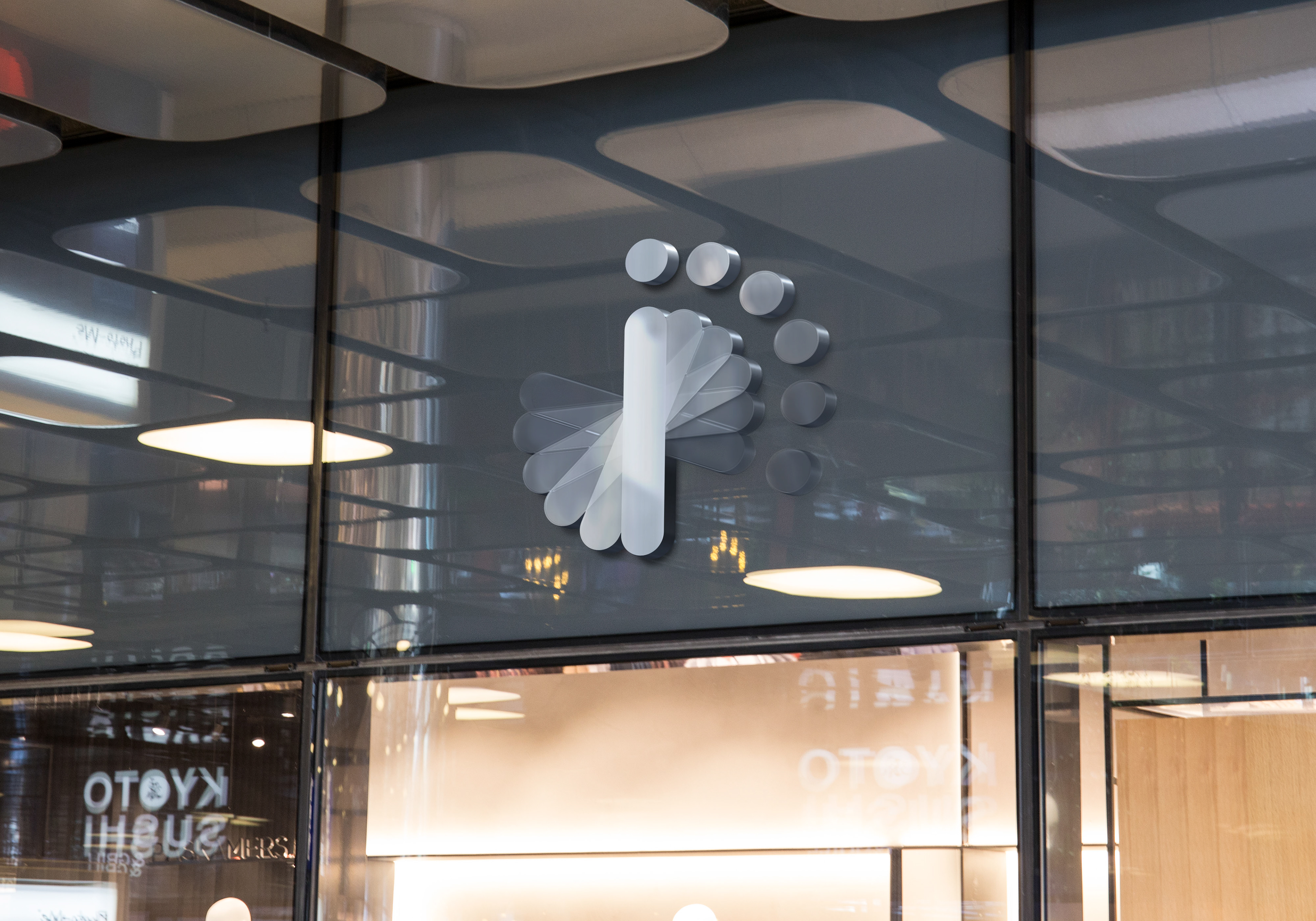
The brand utilizes environmental graphics as seen of exterior and interior designs as well as banners that are design with heavy use of our logo. Also using colours from our logo to flood out to the furniture in the interior style of our brand.
The main focus of these graphic are to expand on our logo by using the colours and the logo itself within the designs allow i to hold a consistent design style through all elements.
The simplicity of i needs to be incorporated into everything they do keep clean white, light grey and pale neutral coloured walls to keep the environment that clients come into remain simple, modern and echo the characteristics of the brand.

Visual Style:
The i stationary system consists of letterheads, business cards and a digital signature designed specifically with heavy use of the logo and the colours used from the logo.
The business card is double sided with contact information alongside the logo and the furniture for our brand designed from elements of our logo. With the back side black our brands tag lines are displayed to motivate people who receive the card to look into the brand to solve their problems.
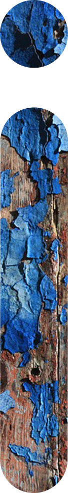
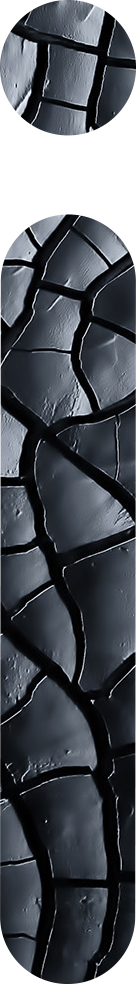
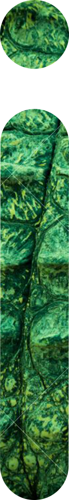
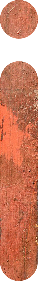
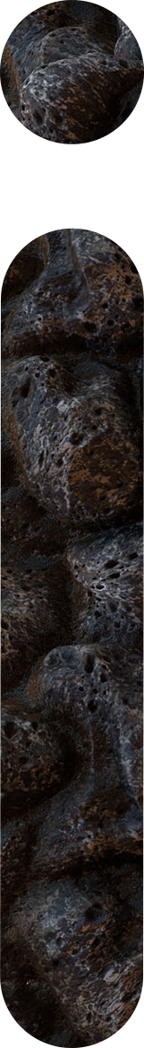
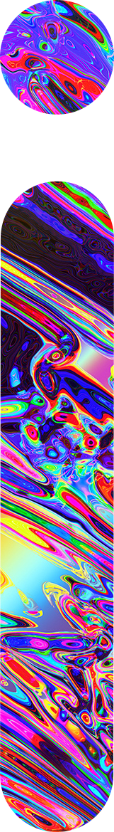
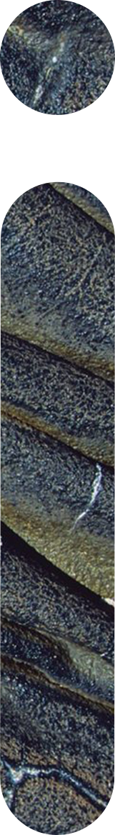
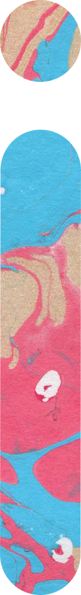
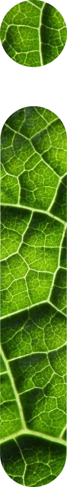
Brand Textures:
Incorporating different textures within the i of the brand that can be seen used throughout the brands digital presence, illustrates the playful and creative side of the brand. The textures have been carefully chosen and designed within the i to directly relate to the creative opportunities available at the University of Northampton.


Website Concept:
The style behind the web pages remain simple with heavy use of negative space to echo the simplicity of i's services and the brand style as a whole. Using the textures to help visually guide people through the website, the textures also visually address our diversity in solving a wide range a problems for employees by facing them with a wide range of young professionals.
The examples shown display our home page on a computer screen as well as a mobile phone screen. As well as an example page of a specific creative section displaying how the textures, logo and chosen typefaces for the i brand work in different environments.

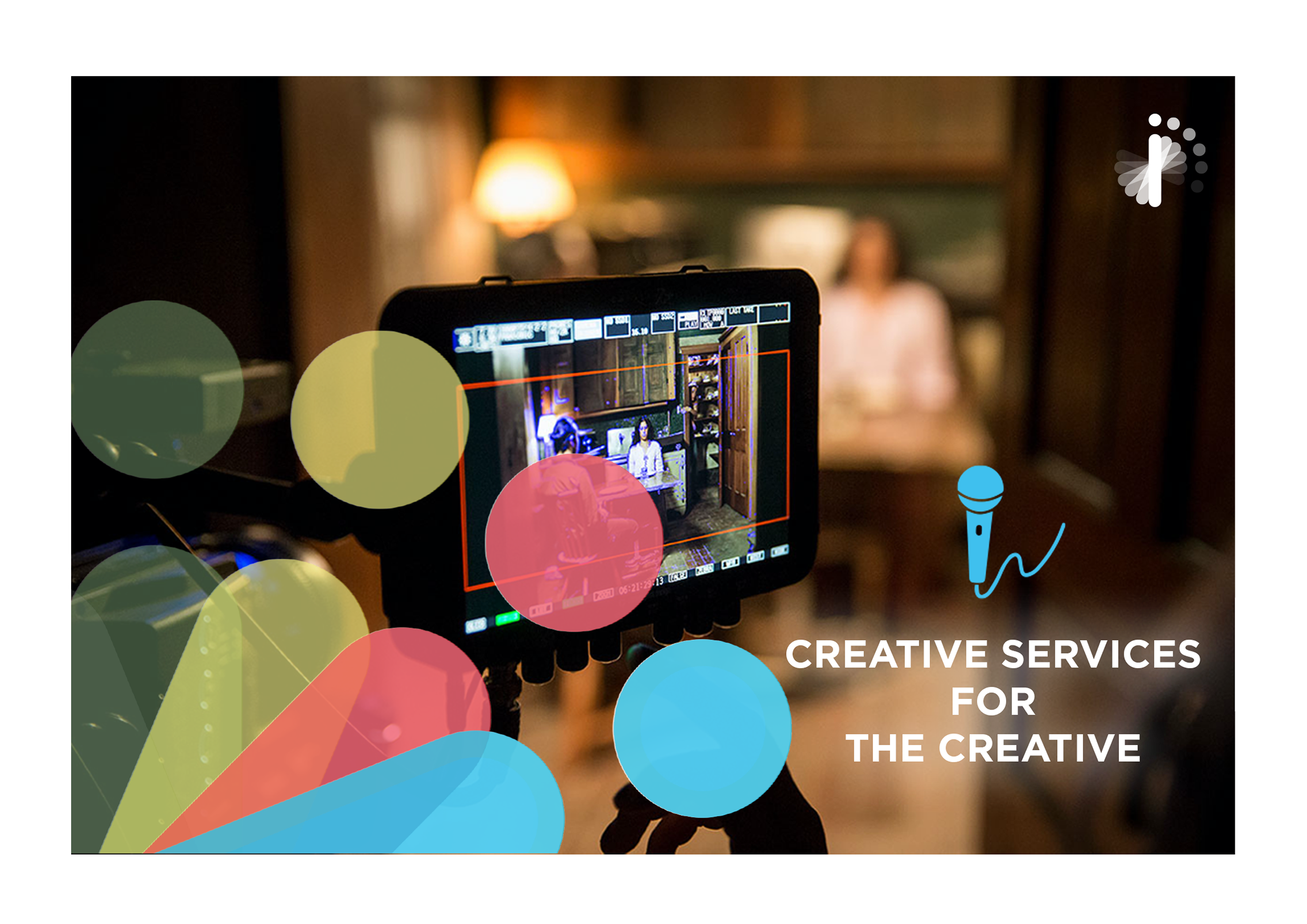
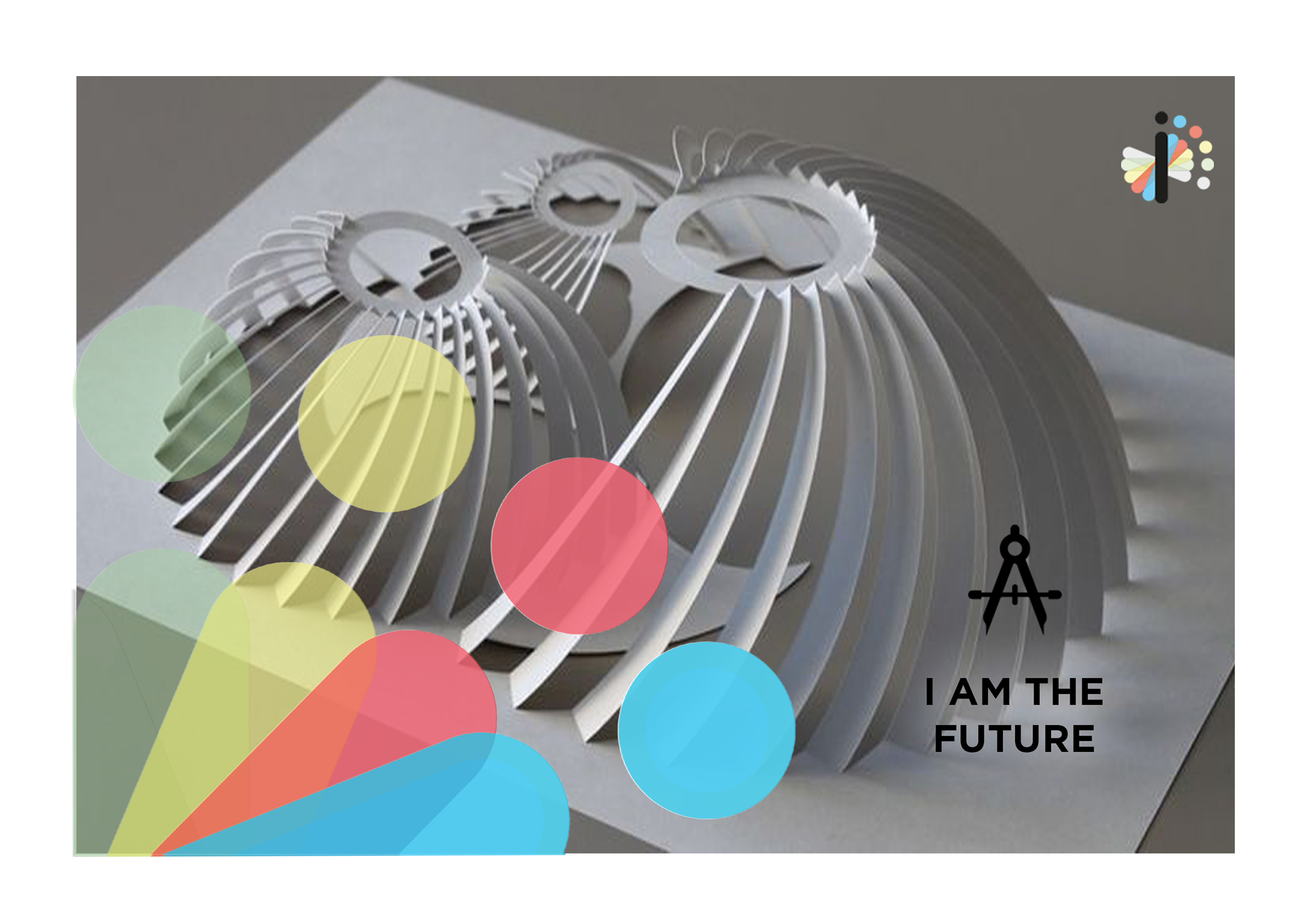
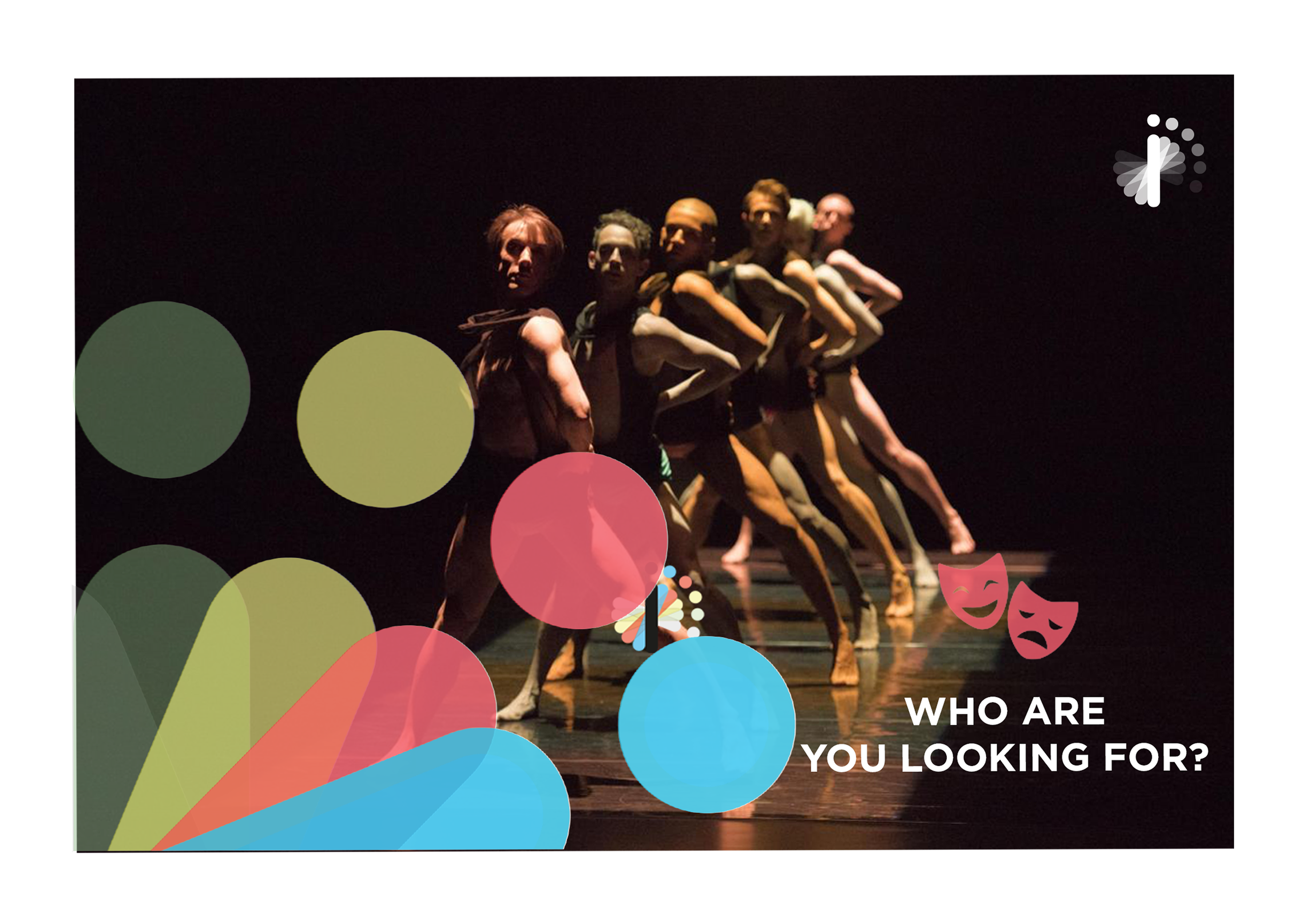
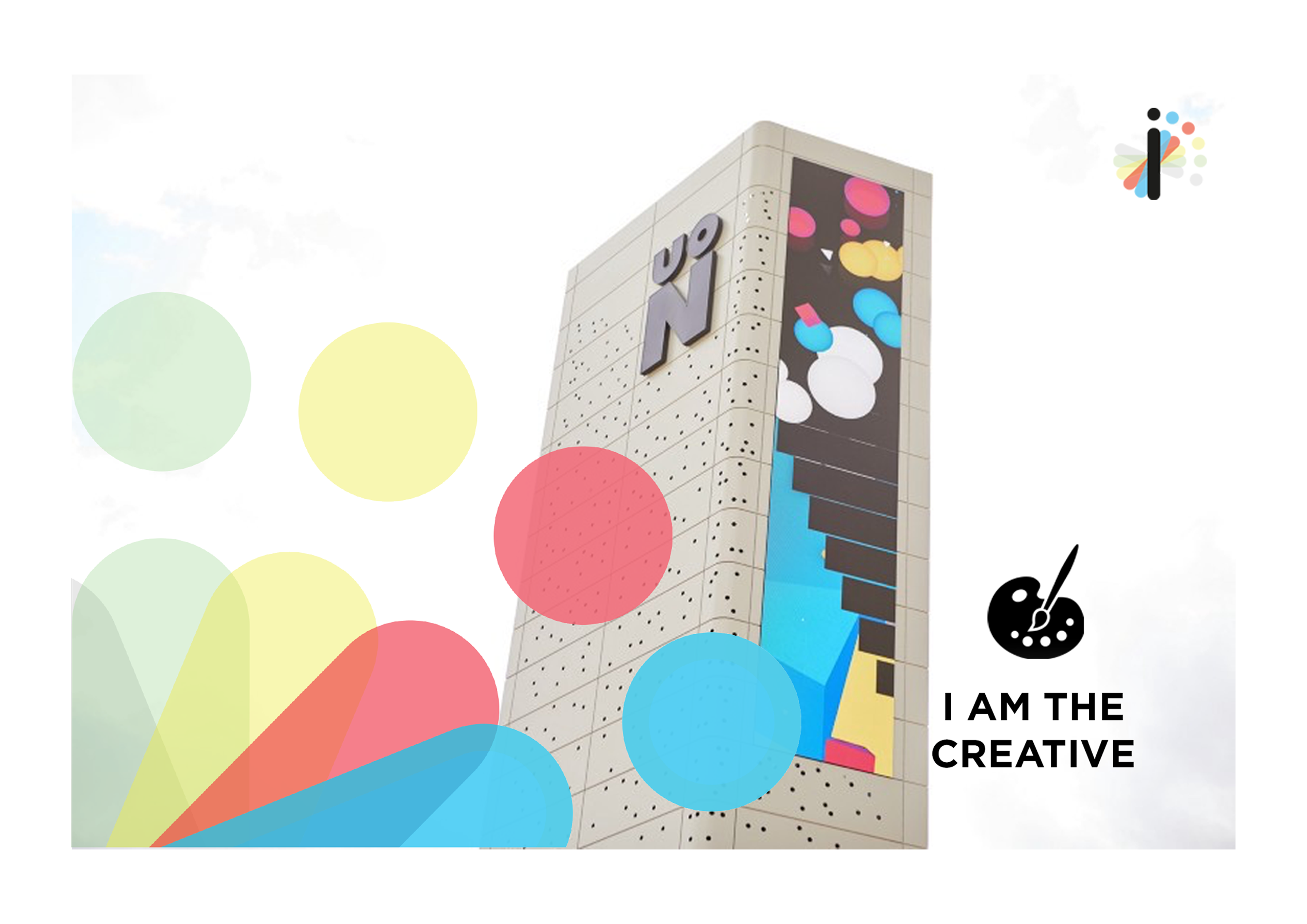
Digital Banners:
Campaigns are typically updated/refreshed on a quarterly basis, with the intention of launching a new or evolved brand message. Banners provide the opportunity to explore new visual concept within our guidelines.
These campaigns showcase both the mono-chromed and full colour versions of the logo in use, displaying when it is appropriate to use the different varieties of logo.