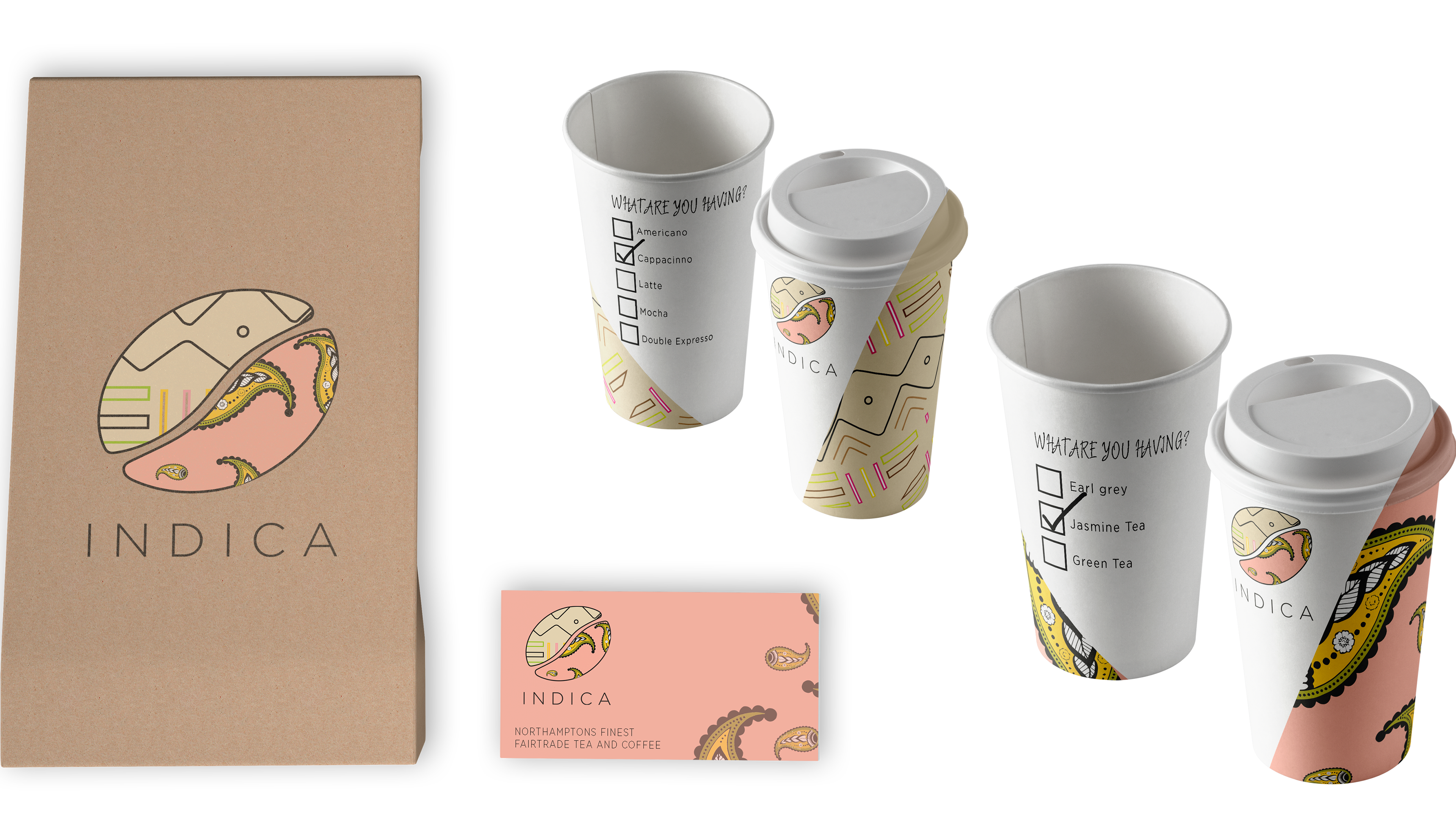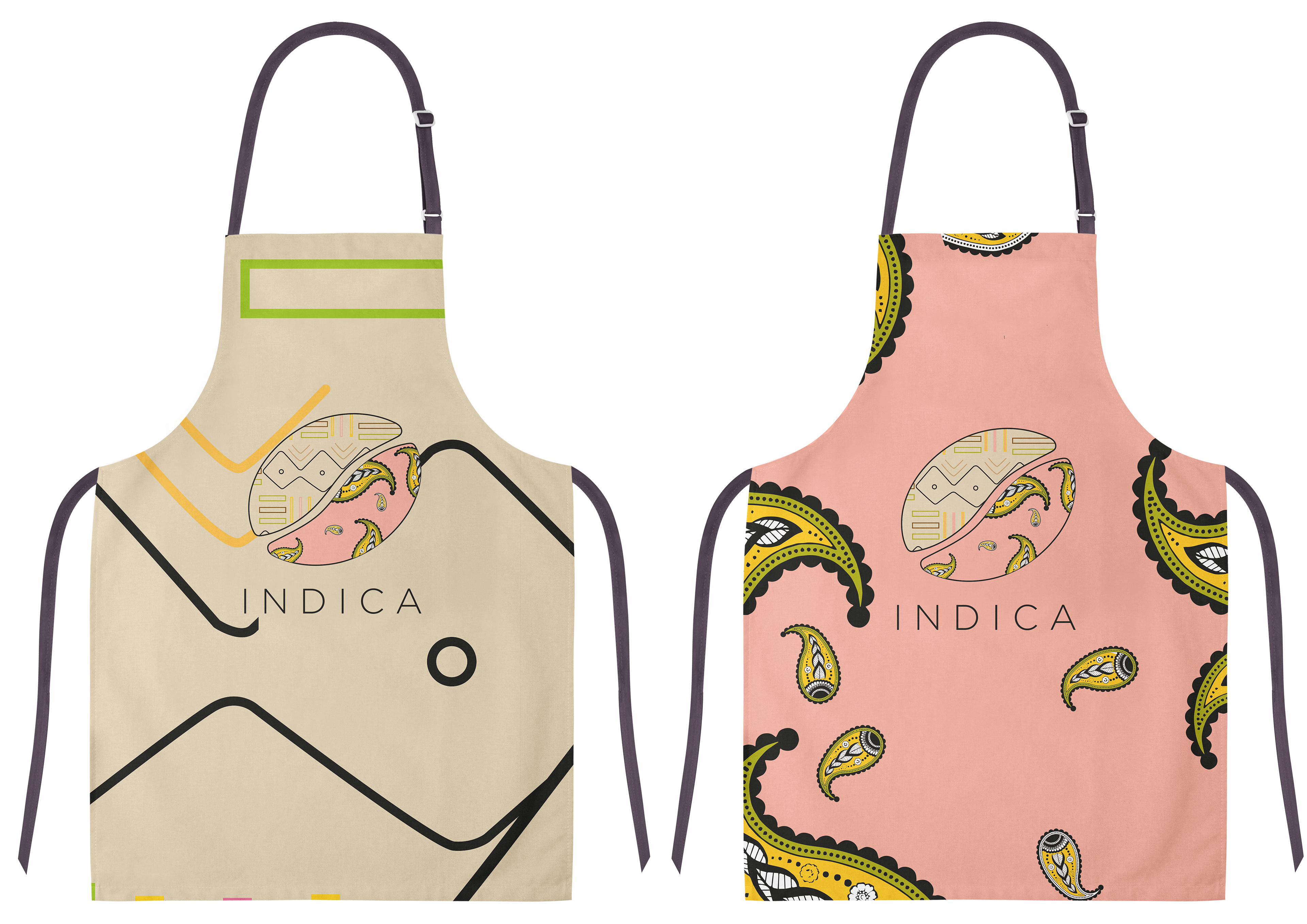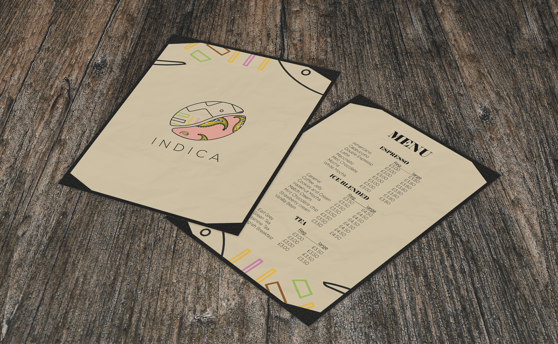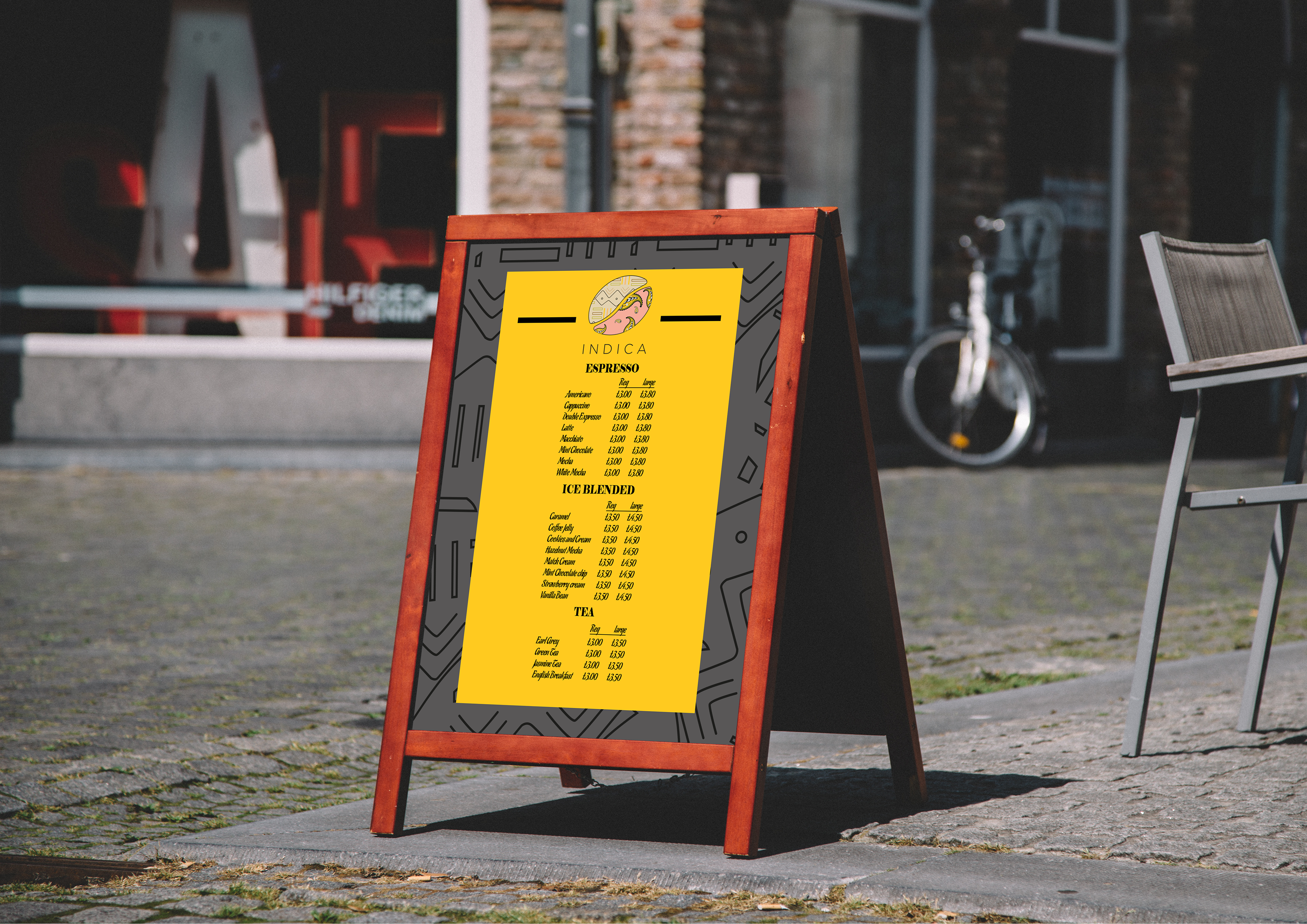
NORTHAMPTON COFFEE SHOP REBRAND
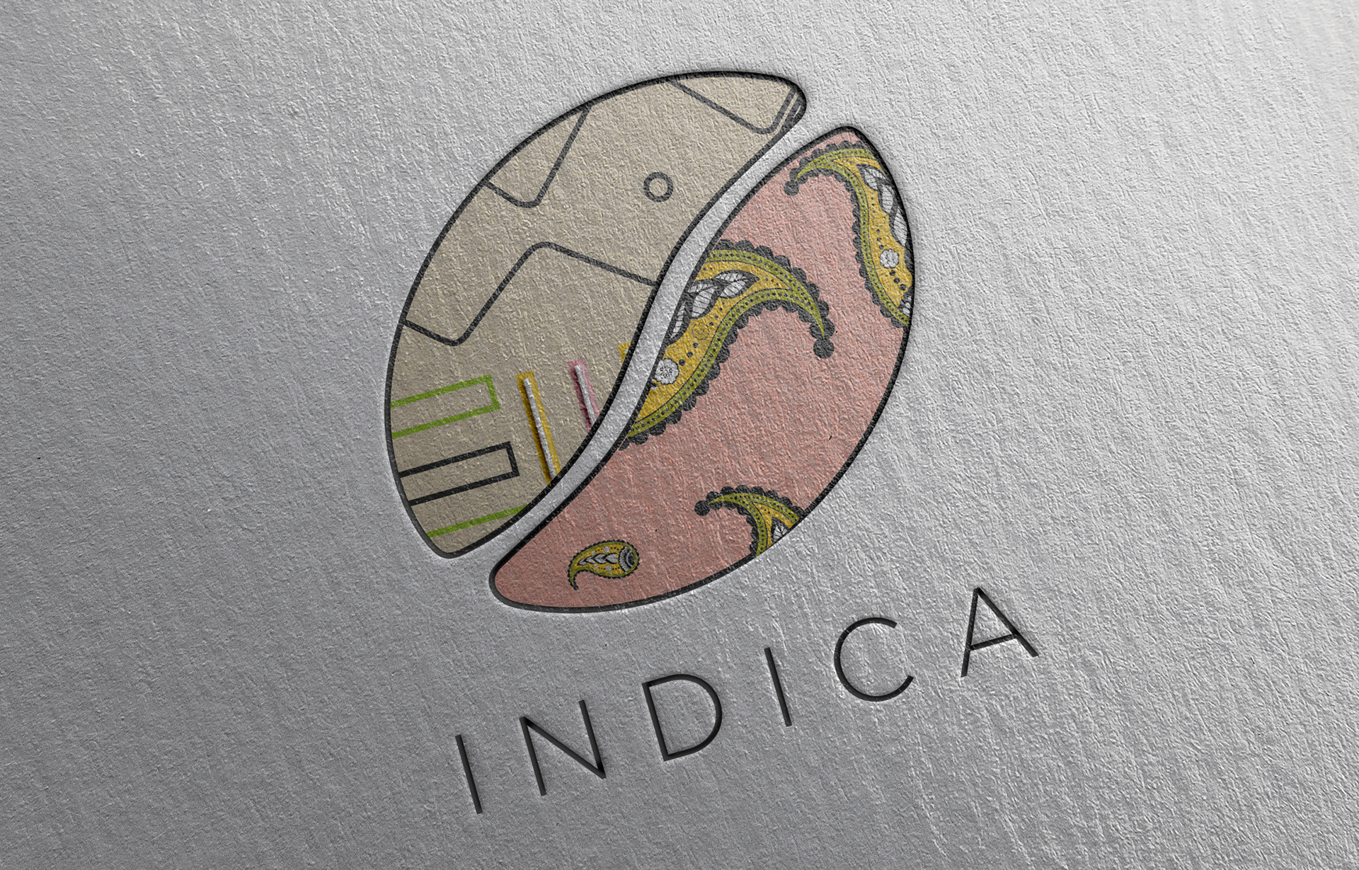
The brief required a name and visual identity for a local Fairtrade tea and coffee shop with the target audience being 20 - 30 year old people. I used bright colours alongside patterns to communicate to my target audience. Traditional patterns from the countries where tea and coffee originate inside a coffee bean linking with the name which is an abbreviation of India and Africa.
Logo Breakdown:
Inspired by the origins of tea and coffee alongside the culture behind them. I incorporated pattern designs from Ethiopia and India and placed them into each side of a coffee bean.
Visual Style:
Bright, colourful & simple, alongside the brand name being a homograph matches the attitude & style of target audience. The bright colours and patterns are reflected across all outcomes to maintain the brands attributes throughout.