MK DONS FULL KIT CONCEPT
Home Kit Concept:
Taking elements of the clubs logo itself and blowing it up big to wrap around the kit creates a new and contemporary style to the kit that is not intruding on any of the important elements such as the players name, number and sponsorships. By taking an element of the clubs logo and using it as the main design feature of the kit work in synergy with the clubs current visual style and maintains cohesion throughout the club creating a brand.
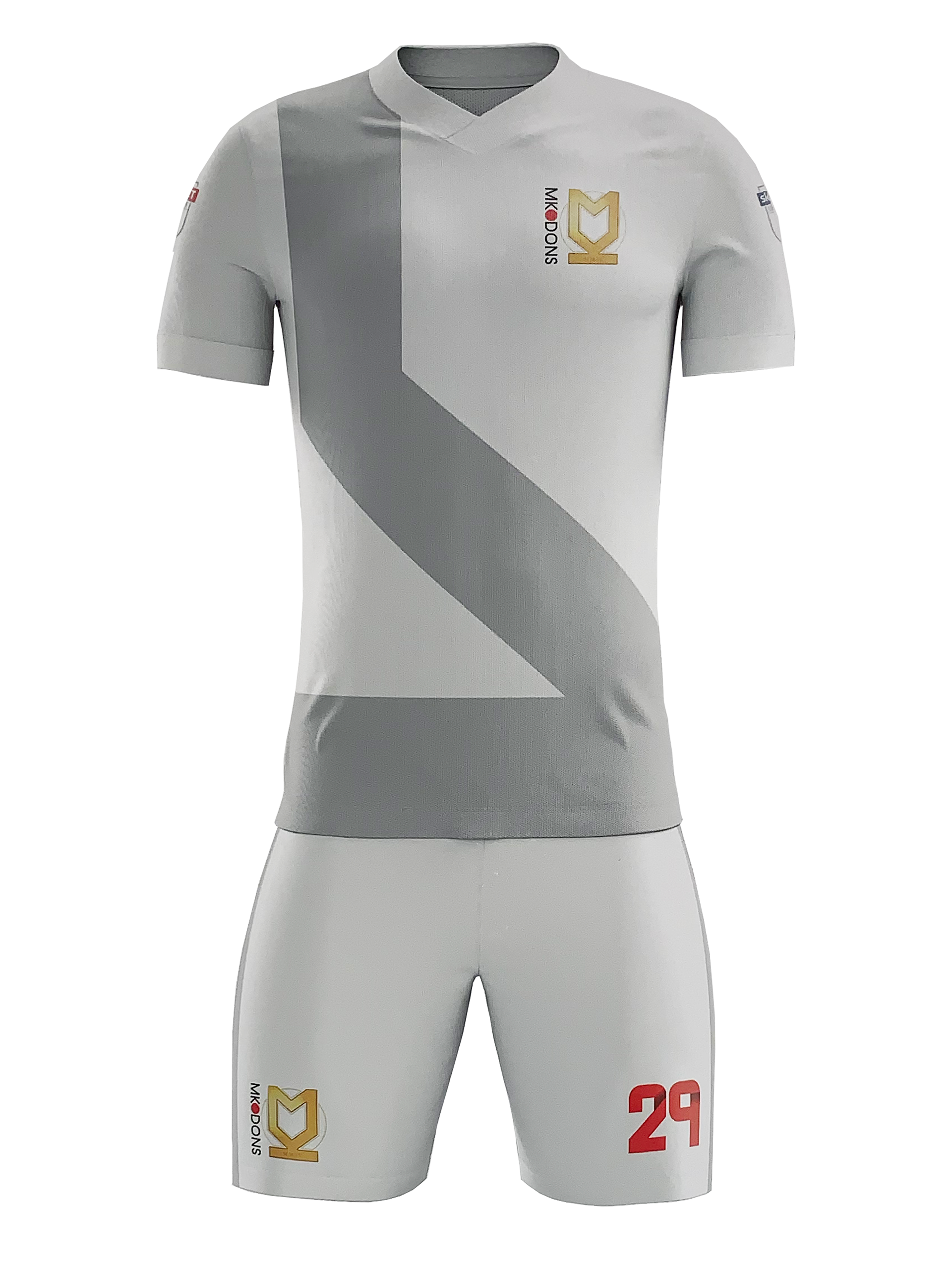
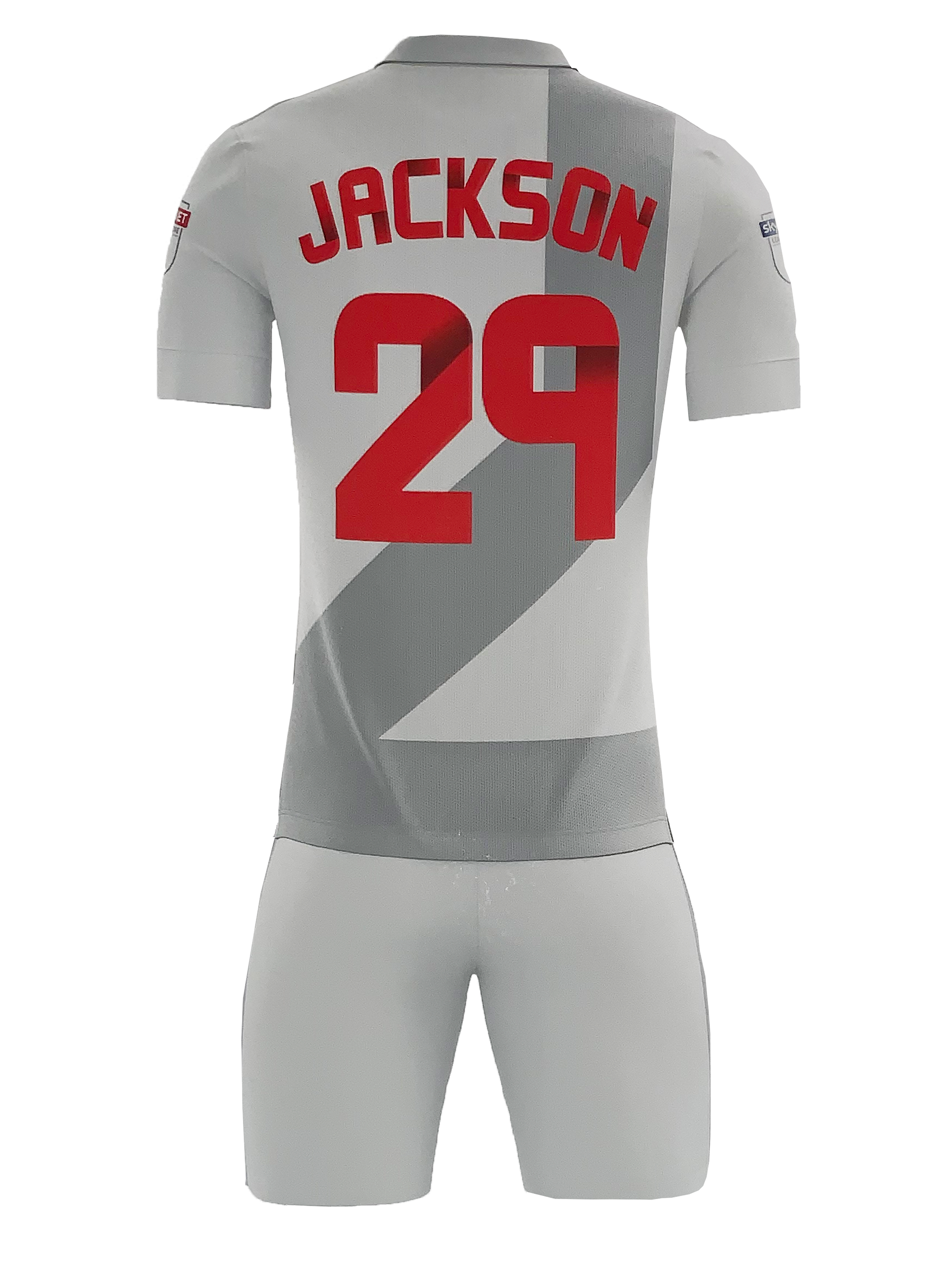
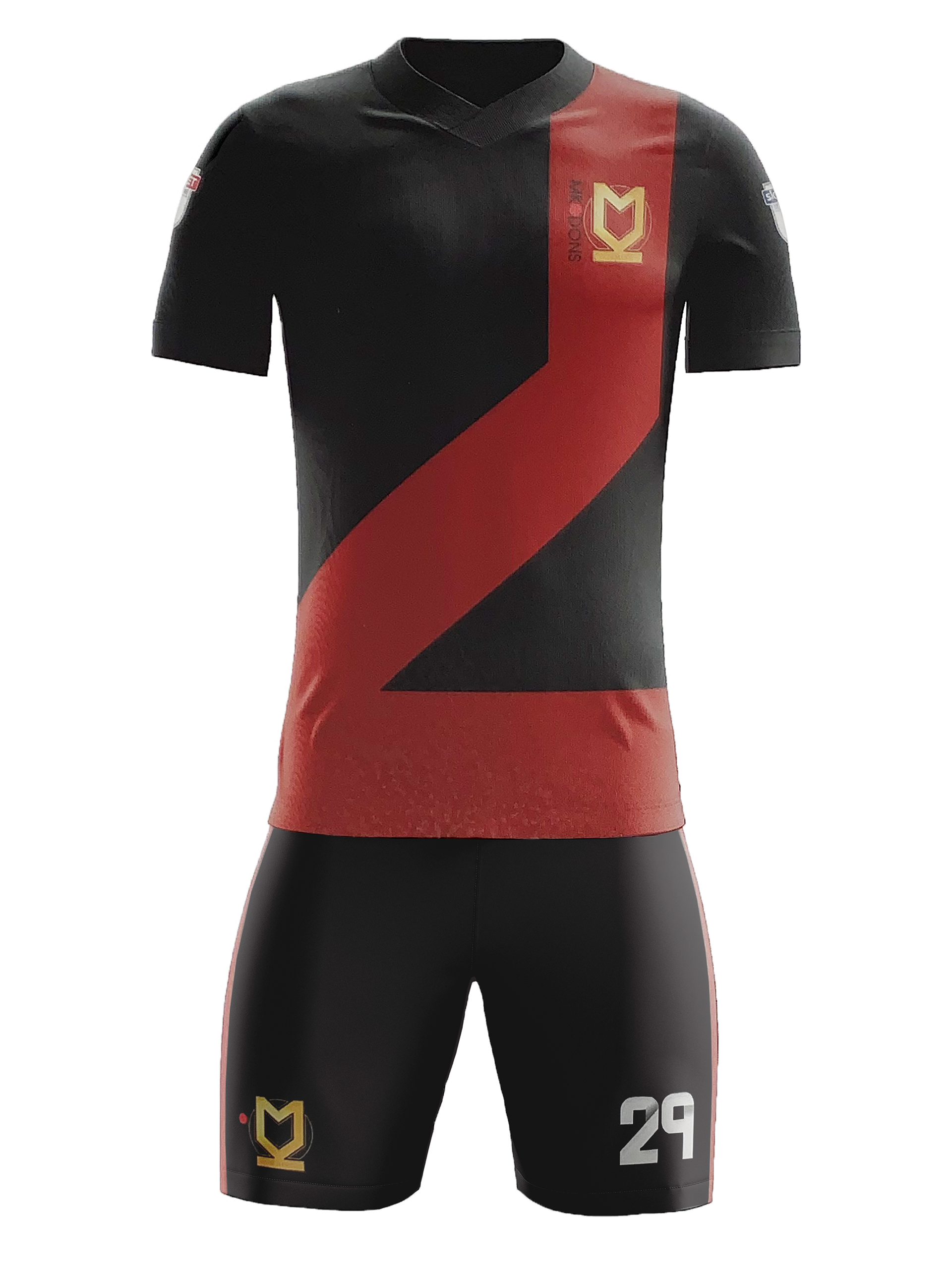
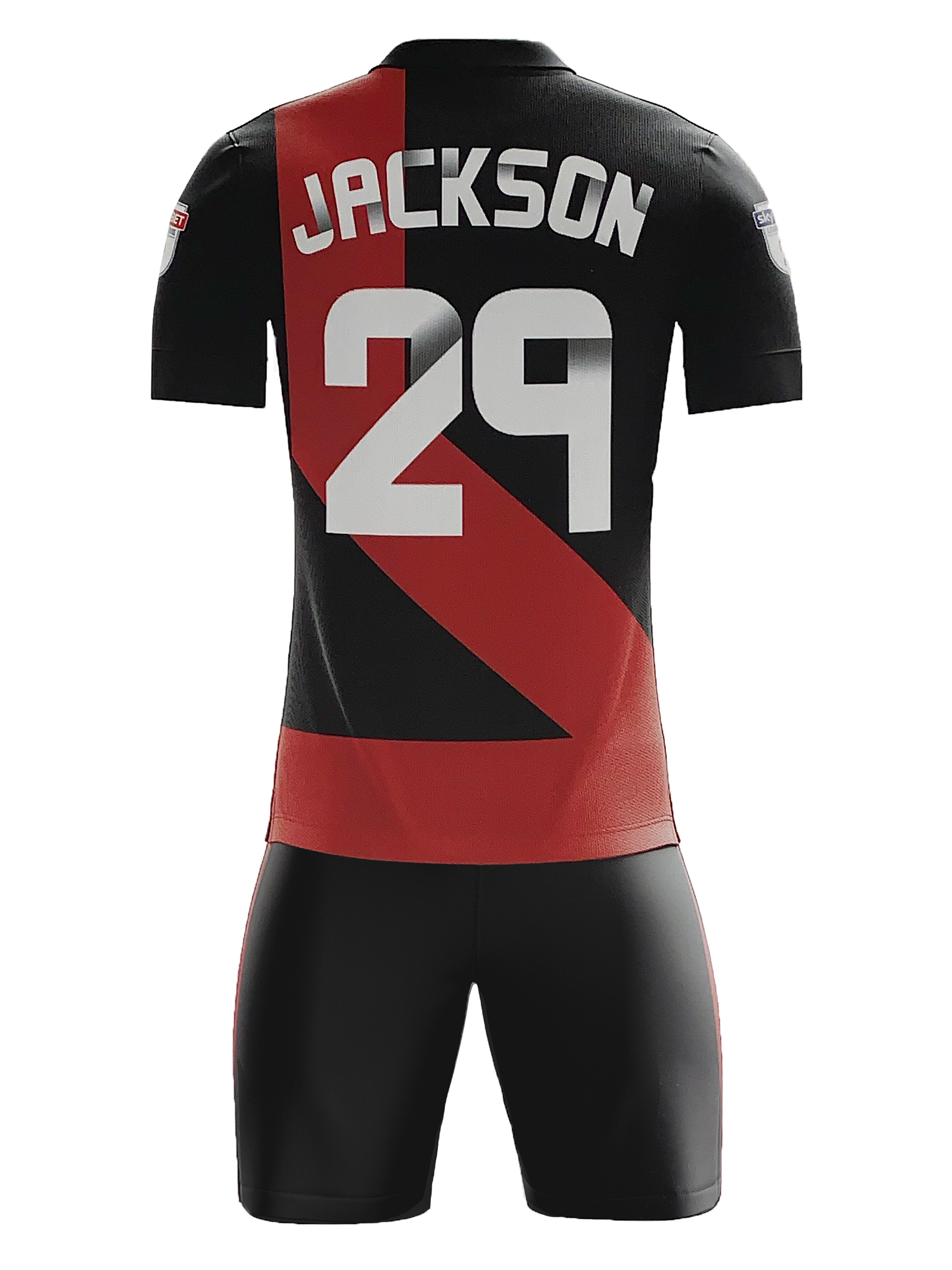
Away Kit Concept:
The blown up elements of the clubs logo is flipped on the away kit and designed in a darker colour palette to visually stand out from the home kit design. The use of the dark red within the clubs brand puts emphasis on the logo element that is used as the main design of the kit against the black.
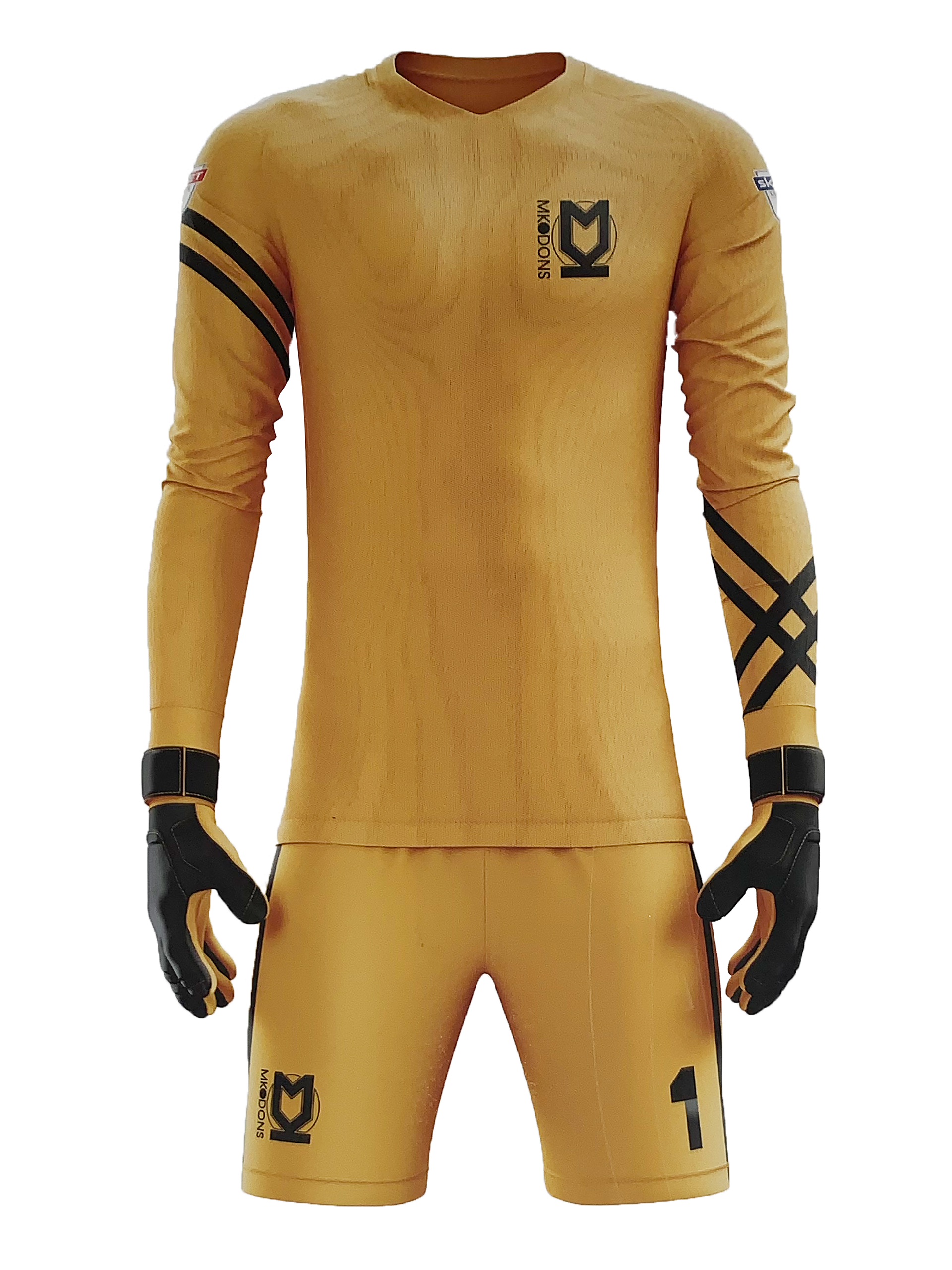
Goal Keeper Kit Concept:
Using Milton Keynes as my inspiration for this kit design as this is the clubs home town, I decided to incorporate a grid design on the sleeves of the kit as Milton Keynes is known for its layout, all the roads and navigation within Milton Keynes is based off a grid. Keeping the design within this kit purely on the sleeves and being in a bright yellow colour was on purpose to avoid any confusion on the pitch when players are wearing the kit. Being such a fast paced game players need to be able to identify other team members quickly and with ease so by making this kit a bright contrasting colour to both the home and away kit allows the players to identify their goal keeper with ease.
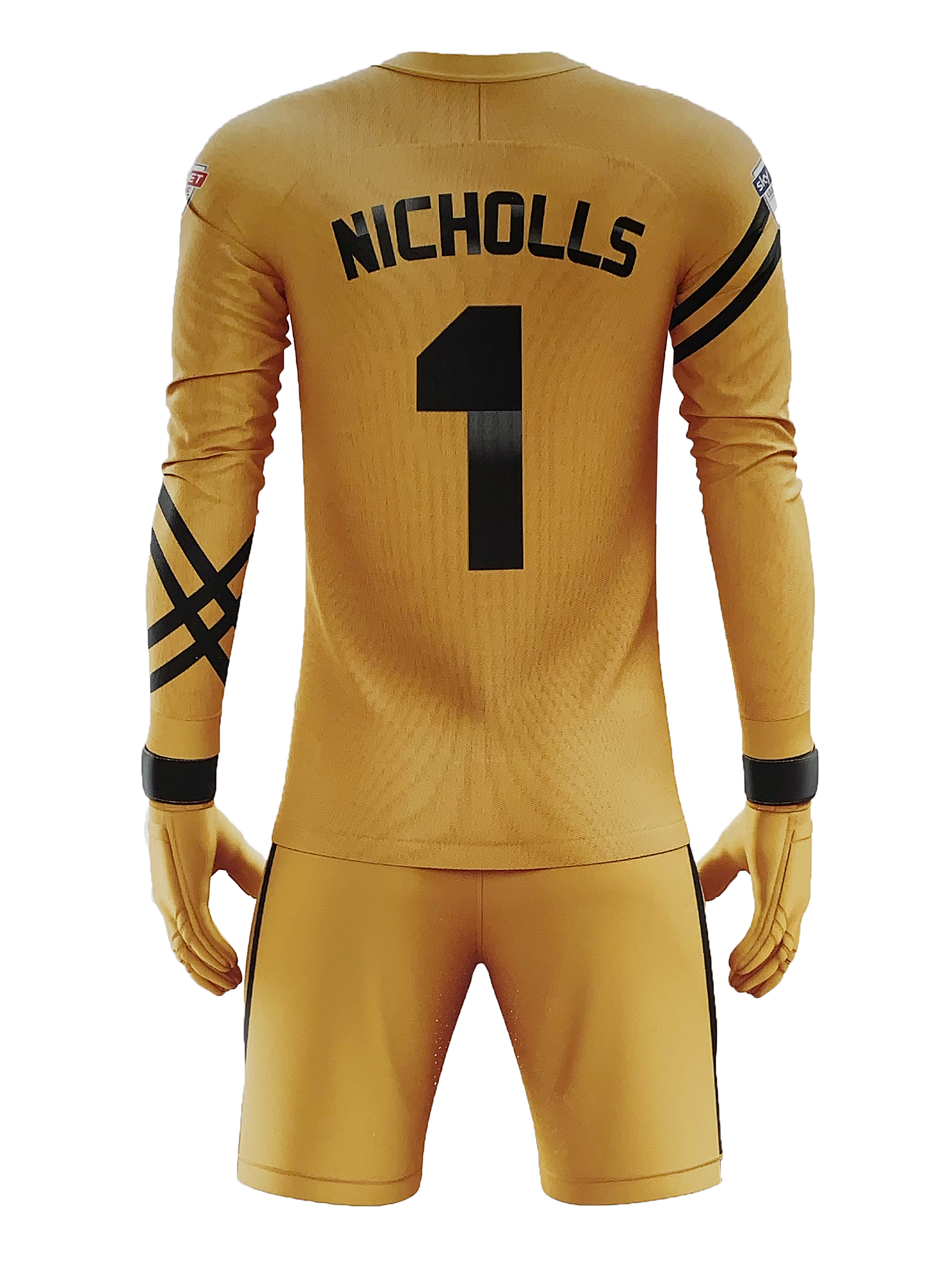
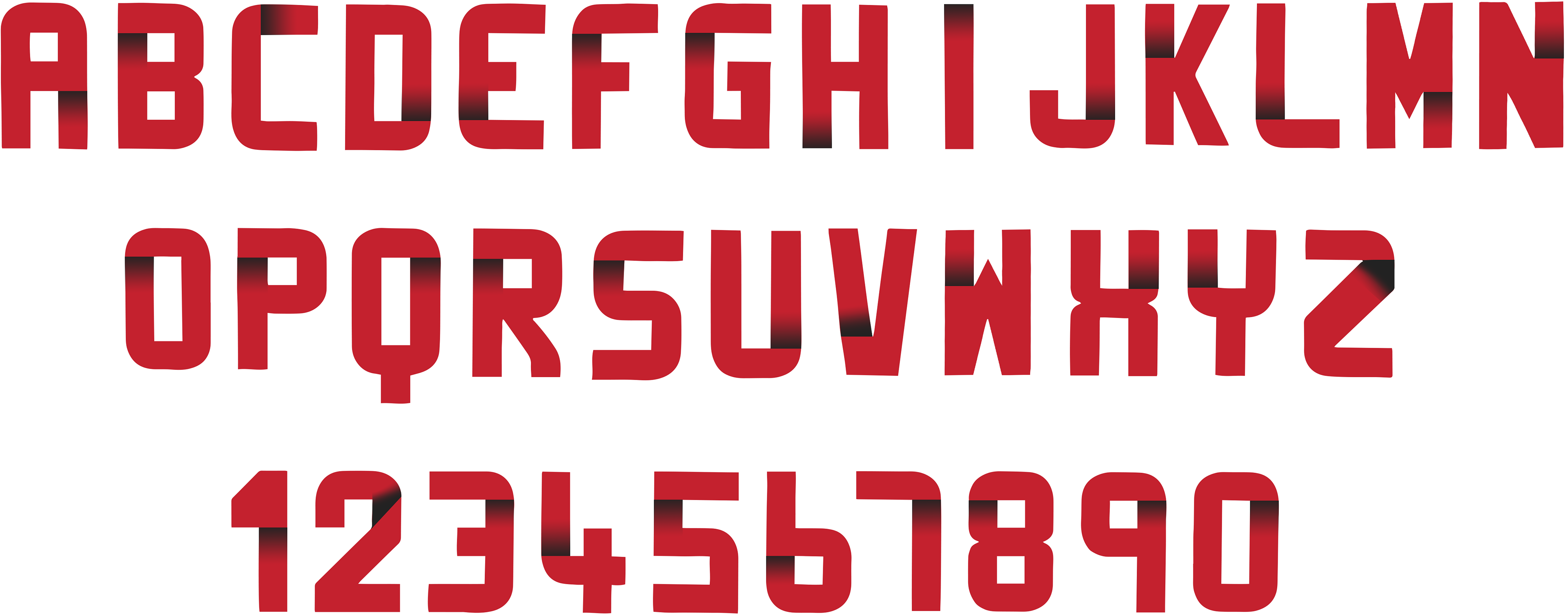
To give the kits design an even more unique style I designed a whole new typeface to use for the player’s names and number. Creating a three dimensional typeface by adding depth to the typeface with gradients makes the type really pop out on the kits not only creating a visually pleasing type but it also boosts its legibility.