DREAM BIG DO BIGGER CAMPAIGN
Environmental Graphics
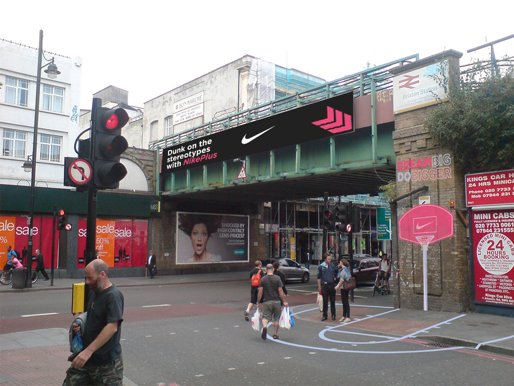
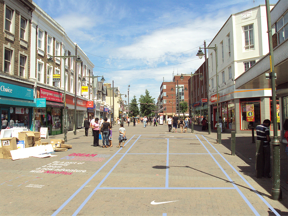
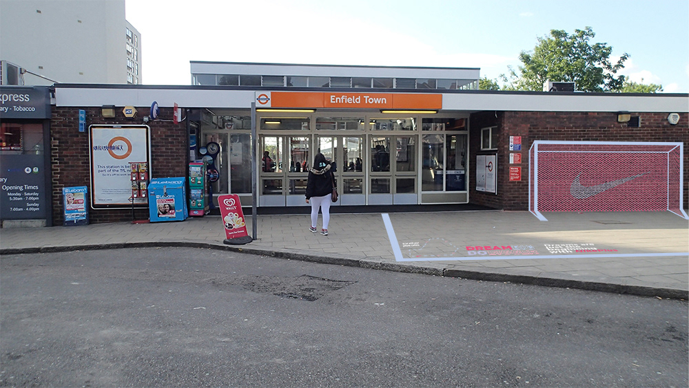
A campaign that predominantly consists of physical and environmental outcomes to reinforce the requirement of the brief, using specifically chosen environments as the canvas for my outcomes to bring the sporting opportunities with NikePlus to the target audience directly. Engagement is at the heart of my campaign, creating not only visual aesthetics but an experience, a journey for young girls within London. The engagement is the start of the process to get the target audience active with NikePlus.
Focused on specific sports that women/girls have less involvement in to display that NikePlus can provide the access and opportunity required for young girls to achieve or work towards their dreams. “DREAM BIG DO BIGGER” the logo and slogan for my campaign is engaging and aspiring and was specifically design and chosen to motivate the target audience as soon as they’re exposed to the campaign.
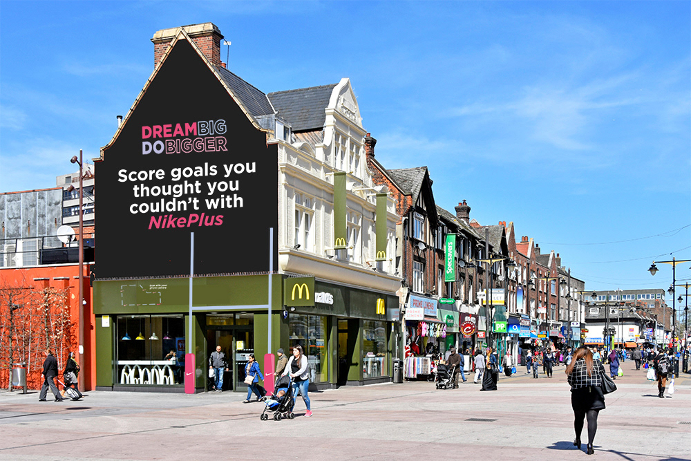
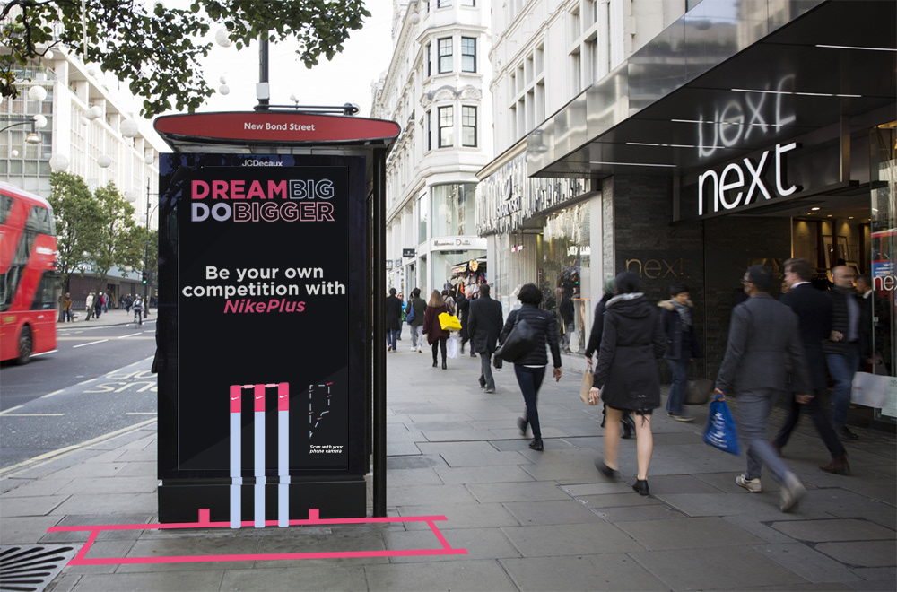
Posters:
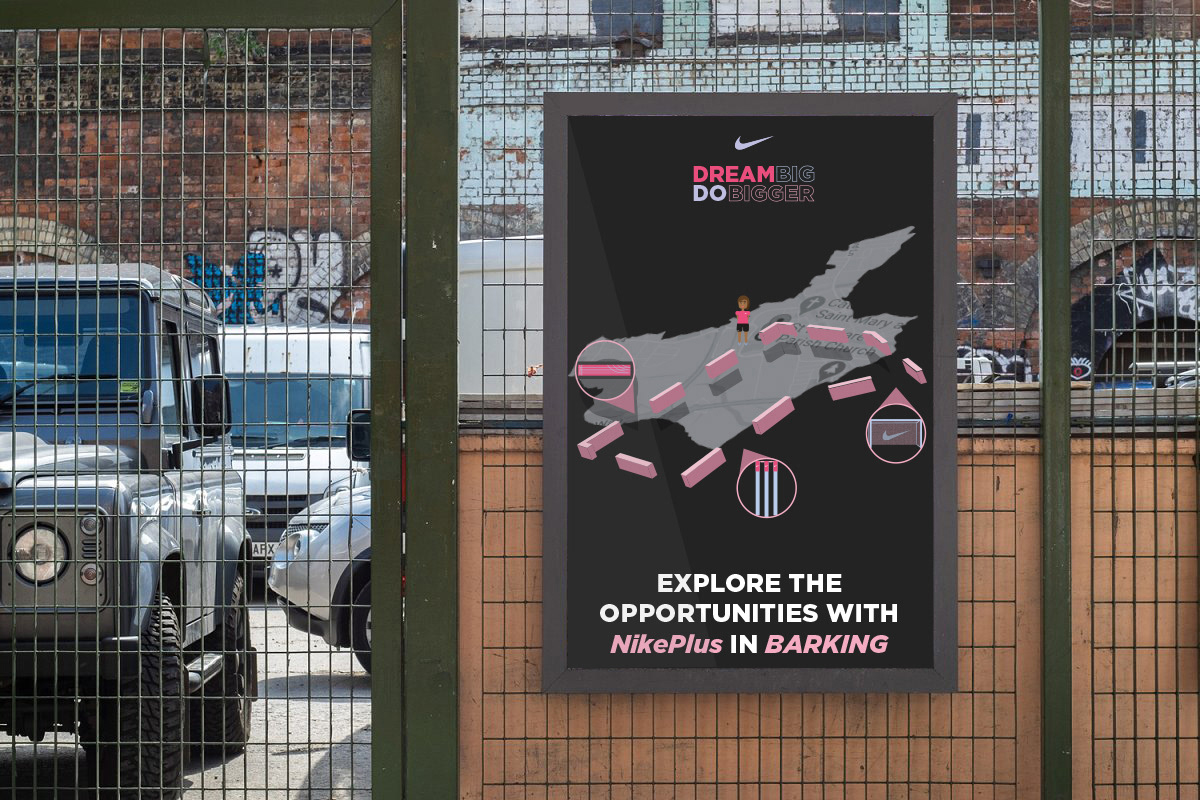
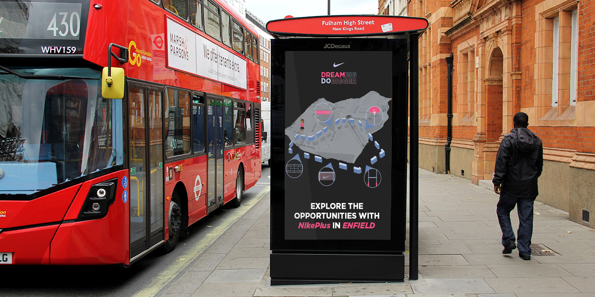
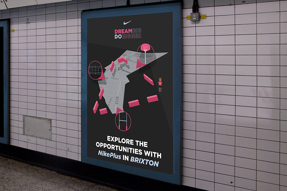
The posters focus purely on the map designs to allow the viewer to understand that there are designs to be seen. the use of the map also gives the viewer an invitation to experience NikePlus whilst informing them as to where this campaign can be seen.
Combining both my map designs with the actual map shape and design of the locations where my campaign will be to not only keep synergy throughout my campaign but also to provide accurate information for whom may want to go and explore the campaign in further detail.
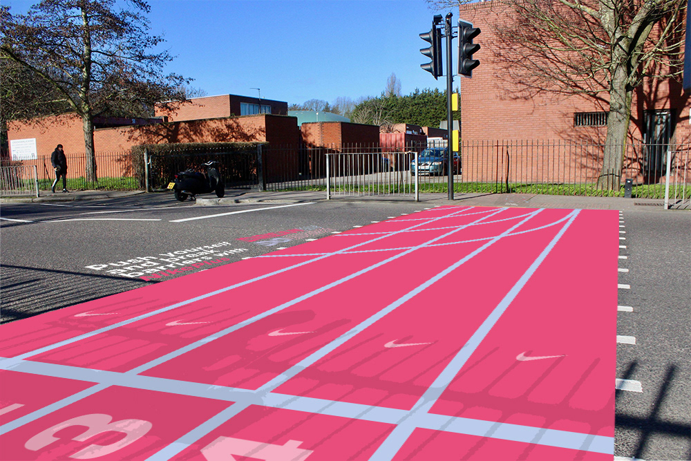
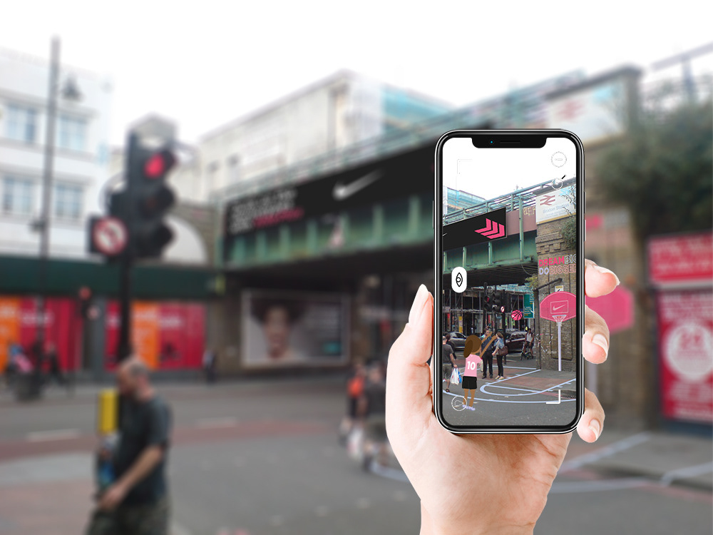
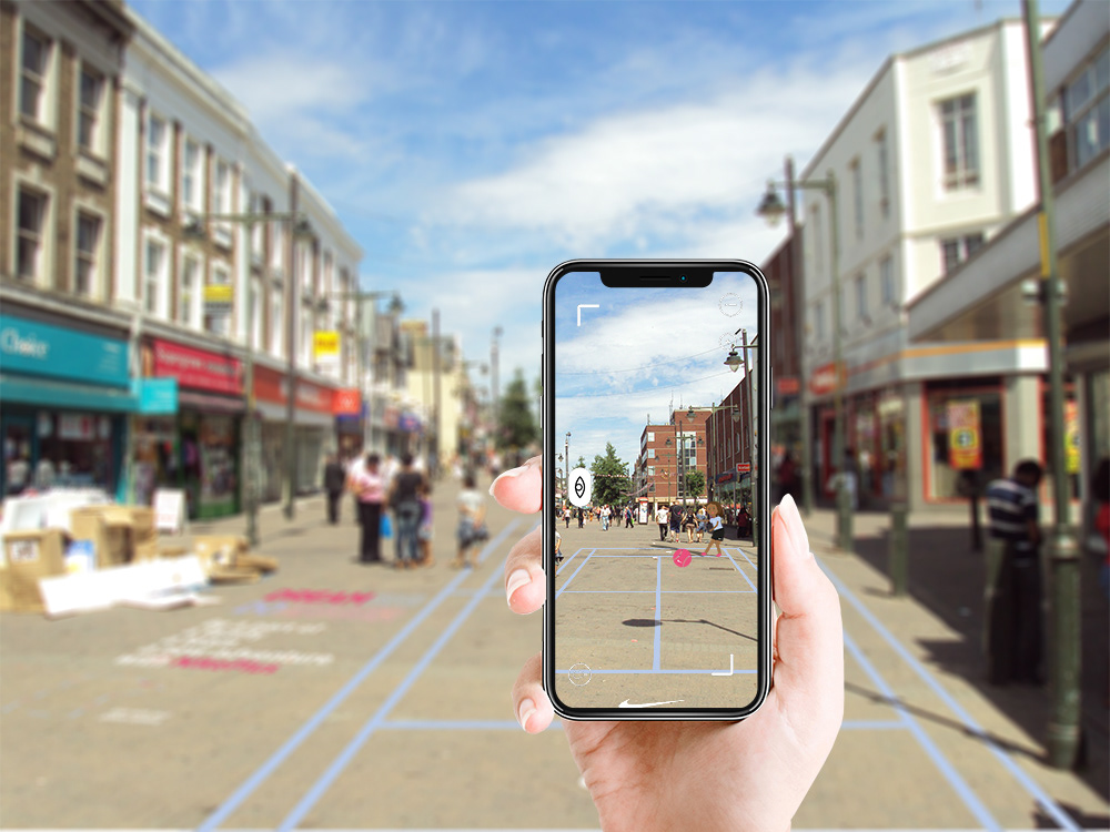
Artivive Animations:
To further reinforce the interaction between the viewer and the campaign, a series of Artivive animations accompanies the campaign displaying a young girls character performing sporting activities with the environmental graphics, bringing the designs to life.
Not only does this make the campaign more engaging but it also informs the viewer on the sport being displayed educating the target audience on what is being proposed to help kick start their new adventure.
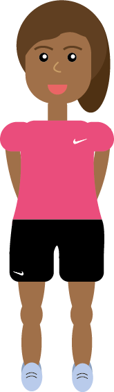
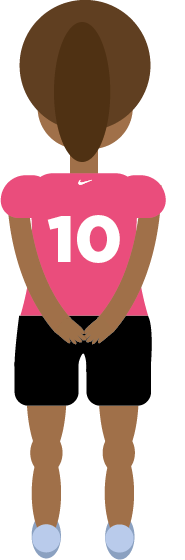
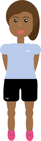
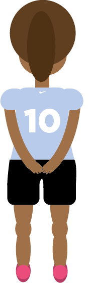
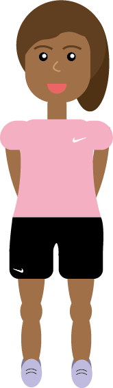
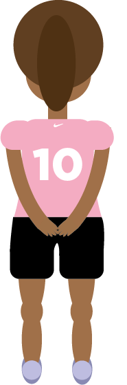
Campaign Character:
The character was designed to allow the target audience to be able to relate to the campaign on more personal level to help make ‘Dream Big Do Bigger” as memorable as possible whilst again reinforcing the notion of interaction throughout all elements of the campaign.
The young girl character is incorporated throughout the poster designs, app design and animations to give the viewer a narrative to follow throughout the campaign.
A variety of colours have been designed to allow the character design to be versatile as the designs within the campaign are placed in multiple different environments.


Campaign Map Designs:
Each map design is based off of the particular areas:
1 - Dagenham
2 - Enfield
3 - Brixton
4 - Harringay
5 - Barking
6 - Dagenham (Different area)
By creating map designs that accompany the environmental graphics the viewer is able to understand that there is more to be seen within the campaign and gives them opportunity to explore what NikePlus has to offer around the particular area they’re in.
The map concept also allows the opportunity for interaction with the viewer and the designs which is essential when reaching out to a younger audience because in this day in age young people want to feel in control and have a say in anything they are a part of.
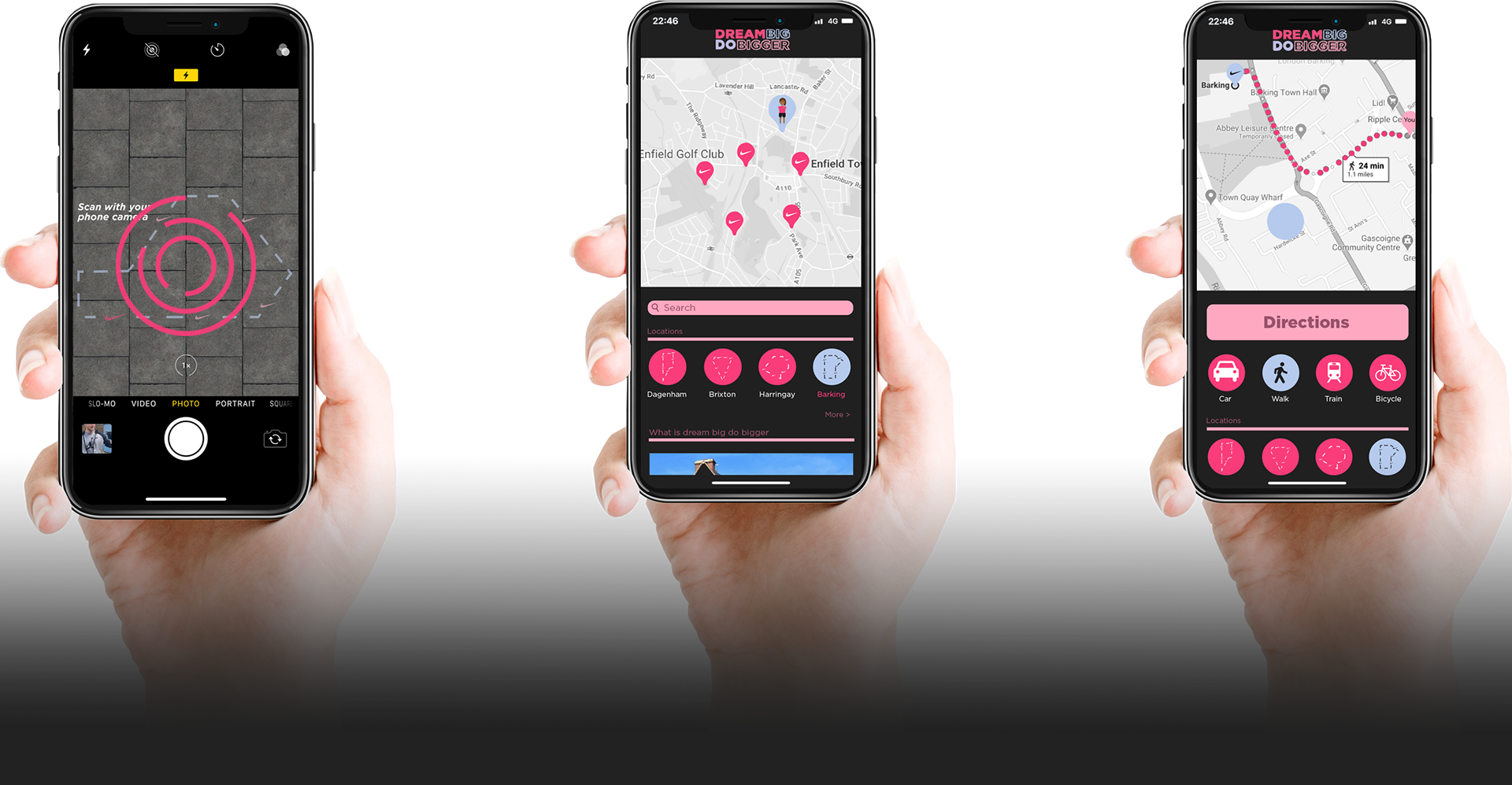
Map App:
The maps that have been designed can be scanned with a mobile phone camera that links to the NikePlus app, pushing the campaign into a digital environment, allowing the campaign to bleed across into different mediums making it more memorable.
Once the map is scanned the viewer is then presented with an app that displays other interactive environmental graphics within their area as well as providing direction to these other designs to motivate the viewer to explore more opportunities available with NikePlus.